Analysis of d11221.002 Data Set
Table of Contents
Sys.setlocale(category="LC_MESSAGES",locale="C")
[1] "C"
1 The data
1.1 Location and origin
The data set d11221.002.dat is contained in folder d11221 which is freely available (after registration) from the Collaborative Research in Computational Neuroscience (CRCNS) web site. It is located in folder hc-1. I'm assuming here that the data set has been dowloaded and compressed with gzip.
1.2 Information about the data
This data set was contributed by Gyorgy Buzsáki lab, Rutgers University. This data set was used in Henze et al, 2000. The data set is made of recordings on 6 channels:
- channels 1, 2, 3 and 4 are the four recording sites of a tetrode
- channel 5 or 6 is an intracellular recording from one of the neurons recorded by the tetrode.
The sampling rate was 20 kHz. The data were amplified 1000 times. This stuff is what is reported in the d11221.002.xml file associated with the data (we applied a shift of one here since in the xml file channel numbers start at 0).
1.3 Loading the data
The data are simply loaded, once we know where to find them and if we do not forget that they have been compressed with gzip. We will assume here that the data are located in R's working directory:
dN <- "d11221.002.dat.gz"
nb <- 6*10000000
mC <- gzfile(dN,open="rb")
d1 <- matrix(readBin(mC,what="int",size=2,n=nb),nr=6)
close(mC)
We can check that we have loaded the whole set since in that case the number of columns of our matrix d1 should be smaller than 10e6:
dim(d1)
[1] 6 7500000
So everthing was loaded. In terms of recording duration we get (in minutes):
dim(d1)[2]/2e4/60
[1] 6.25
We can quickly check that we did not commit any major mistake while loading the data by looking at one second of intracellular trace in the middle of the set (in pratice we tried both channel 5 and 6 to see that channel 5 is the intracellular one):
plot(window(ts(d1[5,],start=0,freq=2e4),120,130),ylab="",xlab="Time (s)",main="")
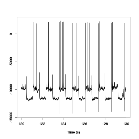
Figure 1: Ten seconds of recording of channel 5 (the intracellular channel) of data set d11221.002. The snapshot is from the central part of the recording.
We do the same for the extracellular channels, except that for clarity we plot only one second of data since they are not high-pass filtered:
plot(window(ts(t(d1[1:4,]),start=0,freq=2e4),120,121),ylab="",xlab="Time (s)",main="")
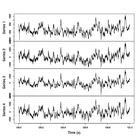
Figure 2: One second of recording of channels 1 to 4 (the tetrode channels) of data set d11221.002. The snapshot is from the central part of the recording.
1.4 Five numbers data summary
We get our classical five numbers plus mean data summary:
summary(t(d1[1:5,]),digits=1)
| V1 | V2 | V3 | V4 | V5 |
|---|---|---|---|---|
| Min. :-8288 | Min. :-7937 | Min. :-7890 | Min. :-7960 | Min. :-14458 |
| 1st Qu.: -599 | 1st Qu.: -409 | 1st Qu.: -429 | 1st Qu.: -411 | 1st Qu.:-11488 |
| Median : -212 | Median : -24 | Median : -40 | Median : -32 | Median :-10530 |
| Mean : -199 | Mean : -10 | Mean : -26 | Mean : -21 | Mean :-10580 |
| 3rd Qu.: 191 | 3rd Qu.: 379 | 3rd Qu.: 368 | 3rd Qu.: 359 | 3rd Qu.: -9778 |
| Max. : 7212 | Max. : 7286 | Max. : 7473 | Max. : 7334 | Max. : 4523 |
We see that the four extracellular channels making the tetrode (columns labeled V1 to V4 in the above table) have similar summaries for the last 3 but the first one has lower values – strange. The summary of the intracellular channel follows a different pattern (column V5).
1.5 Data selection for generative model estimation
We are going to work with the first minute of acquired data to estimate our generative model:
hD <- window(ts(t(d1[1:4,]),start=0,freq=2e4),0,60)
rm(d1)
2 The software
We start by loading file sorting.R containing the sorting specific functions from the web. These functions will soon be organized as a "propoper" R package. The URL of the file is https://raw.github.com/christophe-pouzat/Neuronal-spike-sorting/master/code/sorting.R so the loading is done by dowloading the source file first from its url:
"https://raw.github.com/christophe-pouzat/Neuronal-spike-sorting/master/code/sorting.R"
https://raw.github.com/christophe-pouzat/Neuronal-spike-sorting/master/code/sorting.R
to a file named, guess what
"sorting.R"
sorting.R
using function download.file setting the optional argument method to wget since we are downloading from an https:
download.file(url="<<code-url()>>",destfile="<<code-name()>>",method="wget")
0
The functions defined in the file can then be made accessible from the R workspace – assuming that R has been started from the directory where the previous download took place – with the following R command:
source("<<code-name()>>")
3 Data pre-processing
3.1 Detailed approach
Since the extracellular data were not high-pass filtered we will try our "usual approach", run the analysis on their derivatives (McGill et al, 1985) since taking derivatives high-pass filter the data and reduces spike duration which is good when one deals with overlaps.
hDd <- apply(hD,2,function(x) c(0,diff(x,2)/2,0))
hDd <- ts(hDd,start=0,freq=2e4)
We get a summary of our derivatives:
summary(hDd,digits=2)
| Series 1 | Series 2 | Series 3 | Series 4 |
|---|---|---|---|
| Min. :-5.9e+02 | Min. :-6.0e+02 | Min. :-7.3e+02 | Min. :-8.1e+02 |
| 1st Qu.:-2.0e+01 | 1st Qu.:-2.3e+01 | 1st Qu.:-2.1e+01 | 1st Qu.:-2.0e+01 |
| Median : 0.0e+00 | Median : 0.0e+00 | Median : 0.0e+00 | Median : 0.0e+00 |
| Mean : 5.0e-04 | Mean : 2.0e-04 | Mean : 4.0e-04 | Mean : 6.0e-04 |
| 3rd Qu.: 2.0e+01 | 3rd Qu.: 2.3e+01 | 3rd Qu.: 2.1e+01 | 3rd Qu.: 2.0e+01 |
| Max. : 6.4e+02 | Max. : 5.9e+02 | Max. : 5.9e+02 | Max. : 7.5e+02 |
And we can plot the first 10 seconds:
plot(window(hDd,0,10),ylab="",xlab="Time (s)",main="")
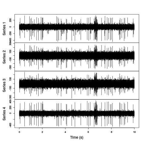
Figure 3: First 10 sec of the first derivative of recording of channels 1 to 4 (the tetrode channels) of data set d11221.002.
Here explore the data interactively is a must:
explore(hDd)
This exploration shows strange LFP like waves around 6.5, 16, 20.5, 28.5, 31.5, 40, 44.5, 57 s.
3.1.1 An attempt to suppress LFPs
Here is an attempt to get rid of them focusing on the data in time interval [6,7].
hDdw <- window(hDd,6,7)
3.1.2 Box filter
We can try box filters with several window lengths to match the low frequency pattern:
hDdwf200 <- filter(hDdw,rep(1,201)/201)
hDdwf100 <- filter(hDdw,rep(1,101)/101)
hDdwf50 <- filter(hDdw,rep(1,51)/51)
We can plot the "original" data from the third recording site together with the different filtered versions:
plot(window(hDdw[,3],6.55,6.6),ylab="",xlab="Time (s)",
     main="",col="grey70")
lines(window(hDdwf200[,3],6.55,6.6),col=1,lwd=2,lty=3)
lines(window(hDdwf100[,3],6.55,6.6),col=4,lwd=2,lty=2)
lines(window(hDdwf50[,3],6.55,6.6),col=2,lwd=2,lty=1)
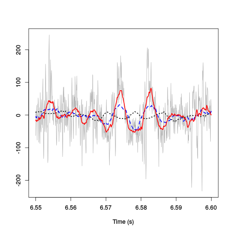
Figure 4: 50 ms of the derivative data on site 3 (grey) together with box filtered versions of it obtained with a box length of 10 ms (201 sampling points, dotted black), 5 ms (101 sampling points, dashed blue) and 2.5 ms (51 sampling points, red).
3.1.3 Gaussian filter
As an alternative we can consider a Gaussian filter (which has better spectral properties):
hDdwf200g <- filter(hDdw,dnorm(-100:100,0,100/3))
hDdwf100g <- filter(hDdw,dnorm(-50:50,0,50/3))
hDdwf50g <- filter(hDdw,dnorm(-25:25,0,25/3))
We can plot the "original" data from the thirs recording site together with the different filtered versions:
plot(window(hDdw[,3],6.55,6.6),ylab="",xlab="Time (s)",
     main="",col="grey70")
lines(window(hDdwf200g[,3],6.55,6.6),col=1,lwd=2,lty=3)
lines(window(hDdwf100g[,3],6.55,6.6),col=4,lwd=2,lty=2)
lines(window(hDdwf50g[,3],6.55,6.6),col=2,lwd=2,lty=1)
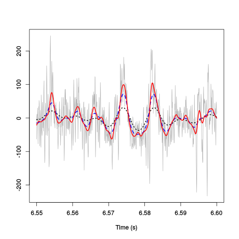
Figure 5: 50 ms of the derivative data on site 3 (grey) together with box filtered versions of it obtained with a Gaussian filter with an SD of 100/60 ms (dotted black), 50/60 ms (dashed blue) and 25/60 ms (red).
3.1.4 Conclusion
Based on these figuree we could decide to filter the (derivative) data with a Gaussian filter of SD 25/60 ms before subtracting this filtered trace from the (derivative) data:
hDdF <- filter(hDd, dnorm(-25:25,0,25/3))
hDdF[is.na(hDdF)] <- 0
hDdB <- hDd - hDdF
Exploring the transformed data with:
explore(hDdB)
shows that's their still some weird stuff around 16, 28.5, 31.5, 44, 57 s but it looks much better than it did initially. Essentially the data are well behaved except during short periods around the indicated times as illustrated in the next figure:
plot(window(hDdB,57.25,57.35),ylab="",xlab="Time (s)",main="")
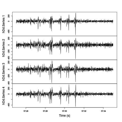
Figure 6: The last weird period of the first minute. A box filtered version (with a 2.5 ms box length) has been subtracted from the data.
3.2 A comparison with more traditional filtering approaches
Instead of using the derivative and then subtracting a sliding average of the data we could use something more traditional like what is done by Henze et al, 2000: "The continuously recorded wideband signals were digitally high-pass filtered (Hamming window-based finite impulse response filter, cutoff 800 Hz, filter order 50)." To do that we start by loading the signal package in our work space:
library(signal)
Loading required package: MASS

Attaching package: ‘signal’

The following objects are masked from ‘package:stats’:

    filter, poly
We then make a high-pass Hamming window-based FIR filter with a cutoff at 800 Hz and an order of 50 with:
FIRhw <- fir1(50,0.8/10,"high")
We prepare a filtered version of our raw data:
hDfir <- ts(apply(hD,2,function(x) stats::filter(x,FIRhw)),start=0,freq=2e4)
hDfir[is.na(hDfir)] <- 0
It then very easy to compare the different versions on a given site with explore:
explore(cbind(hDd[,1],hDdB[,1],hDfir[,1]))
We will do with a comparison of a zoom of the last figure on the first recording site:
plot(window(cbind(deriv=hDd[,1],
                  derivB=hDdB[,1],
                  FIRhw=hDfir[,1]
                  ),57.26,57.32
            ),ylab="",xlab="Time (s)",main="")
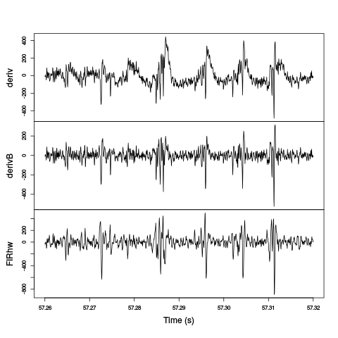
Figure 7: The last weird period of the first minute on the first recording site. Top trace: the derivative of the raw data; second trace: A Gaussian-filtered version (with a 25/60 ms SD) has been subtracted from the derivative; third trace: the raw data have been high-pass filtered with a Hamming window-based FIR filter with a cutoff at 800 Hz and an order of 50.
The last two traces exhibit similar features as far as spikes are concerned. The middle trace as more high-frequency noise.
This comparison suggest that our initial approach: subtract Gaussian-filtered version from the derivative trace works similarly to the more traditional one. Before proceeding further, we detach the signal package:
detach(package:signal)
3.3 A note on the "LFPs"
The "LFPs" isolated by Gaussian-filtering the derivative trace are essantially identical on the four recording sites as shown on the next figure:
plot(window(hDdF,57.25,57.35),,"single",
     col=c("black","grey80","orange","blue"),
     lty=c(2,2,1,1),lwd=c(2,2,1,1),ylab="")
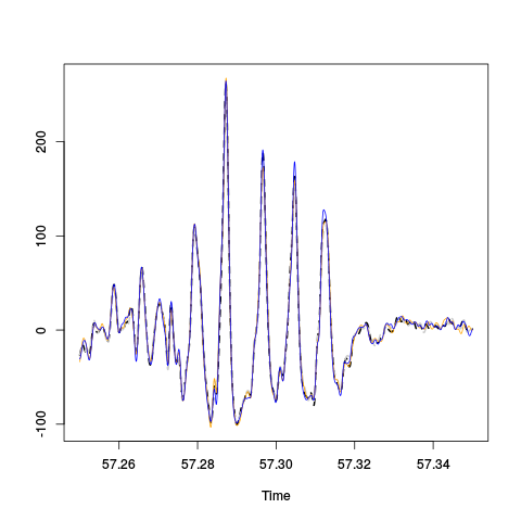
Figure 8: Comparison of the "LFPs" on the last weird period of the first minute on the first recording site. The "LFPs" obtained by Gaussian-filtering (SD : 25/60 ms) the derivative traces are shown: thick dashed black, site 1; thick dashed grey, site 2; thin orange, site 3; thin blue, site 4.
We see 5 oscillations in 40 ms or 125 Hz corresponding to ripples.
Since the four time series are so close it is more informative to plot each one minus the mean of the other three:
hDdFw <- window(hDdF,57.25,57.35)
hDdFwM <- ts(apply(hDdFw,1,mean),start=start(hDdFw),freq=frequency(hDdFw))
hDdFwR <- (hDdFw-hDdFwM)*4/3
colnames(hDdFwR) <- paste("Site",1:4,"resid.")
plot(hDdFwR,main="")
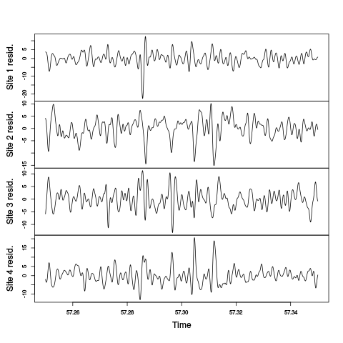
Figure 9: Comparison of the "LFPs" on the last weird period of the first minute on the first recording site. The "Residual LFPs" obtained by Gaussian-filtering (SD : 25/60 ms) the derivative traces before substrating from each LFP the mean value of the three others are shown.
3.4 Overall view of the LFP
The LFPs on the four recording sites are so similar that is makes sense to average them:
hDdFm <- apply(hDdF,1,sum)/4
hDdFm <- ts(hDdFm,start=0,freq=2e4)
Since after Gaussian-filtering we essentially get a low-passed version of the data, we can sub-sample them by a factor of 10 before displaying the whole LPF:
hDdFms <- hDdFm[seq(1,length(hDdFm),10)]
hDdFms <- ts(hDdFms,start=0,freq=2e3)
plot(hDdFms,xlab="Time (s)",ylab="")
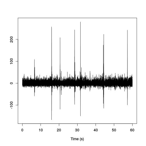
Figure 10: Mean LFP time course. Our previously mentioned "nasty" periods (which are in fact ripples) can be clearly seen.
Here plotting the auto-correlation function computed globally confirms our frequency estimation:
acf(hDdFms,lag.max=2e2)
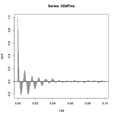
Figure 11: Auto-correlation of the mean LFP. We see clearly 5 periods in 40 ms.
3.5 Detecting ripples
Since our ripples seem to be roughly 5 periods long with a period duration of 8 ms, we can filter the mean LFP trace with few (3) periods of a cosine function of period 8 ms, take the square and filter the whole thing with a Gaussian filter with an SD of 8 ms:
hDdFmsF <- filter(hDdFms,cos((-48:48)/16*2*pi))
hDdFmsF[is.na(hDdFmsF)] <- 0
hDdFmsFF <- filter(hDdFmsF^2,dnorm(-48:48,0,16))
hDdFmsFF[is.na(hDdFmsFF)] <- 0
The whole filtered trace now looks like:
plot(hDdFmsFF,xlab="Time (s)",ylab="")
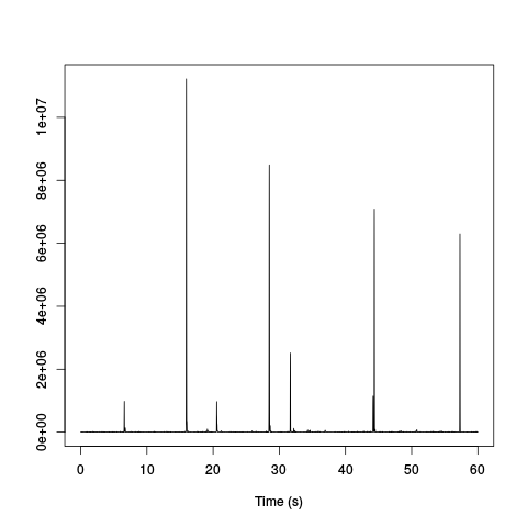
Figure 12: Mean LFP time course filtered with 3, 8 ms long periods of a cosine function, squared and filtered with a Gaussian filter of 8 ms SD. The ripples pop out very clearly.
Ripples can now be detected as points exceeding a properly set threshold on the above trace. After few attempts based on generation of plots with:
plot(hDdFmsFF,ylim=c(0,2e5))
We decided to set the threshold at 1e5:
inRipple <- hDdFmsFF > 1e5
We have to be careful here since we have obtained this inRipple logical vector from a sub-sampled version of the trace. But we are going to use this information later on the "original" data so we have to get the ripple periods right. To this end we will get the real time of the beginning and of the end of the ripples:
ii <- seq(along=inRipple)
start.ripple <- ii[c(diff(inRipple),0)==1]
end.ripple <- ii[c(diff(inRipple),0)==-1]
if (min(end.ripple) < min(start.ripple)) start.ripple <- c(1,start.ripple)
if (max(start.ripple) > max(end.ripple)) end.ripple <- c(end.ripple,length(inRipple))
ripple.bounds <- rbind(start.ripple,end.ripple)/frequency(hDdFmsFF)
This gives us a fraction of round(sum(apply(ripple.bounds,2,diff))/end(hDdFmsFF)[1]*100,digits=1) 1.5 % of sample points within a ripple.
4 Data renormalization and spike detection
4.1 Using the low-pass subtracted first derivative hDdB
We proceed almost as usual and set the median absolute deviation of each recording site to one but we are going to start by computing the within ripples and out of ripples MAD:
idxRipple <- unlist(lapply(1:dim(ripple.bounds)[2],
                           function(i) (ripple.bounds[1,i]*2e4):(ripple.bounds[2,i]*2e4)
                           )
                    )
hDdB.mad <- apply(hDdB,2,mad)
hDdB.mad.in <- apply(hDdB[idxRipple,],2,mad)
hDdB.mad.out <- apply(hDdB[-idxRipple,],2,mad)
all.mad <- rbind(hDdB.mad,hDdB.mad.in,hDdB.mad.out)
colnames(all.mad) <- paste("site", 1:4)
rownames(all.mad) <- c("global","within ripples","out of ripples")
round(all.mad)
              site 1 site 2 site 3 site 4
global             28     33     30     28
within ripples     39     43     41     40
out of ripples     28     33     30     28
We now normalize the whole trace using the global MAD which essentially the out of ripples MAD, but we keep in mind that the noise level is much larger during ripples:
hDdB <- t(t(hDdB)/hDdB.mad)
hDdB <- ts(hDdB,start=0,freq=2e4)
We are going to detect valleys (as opposed to peaks) on a box-filtered version of the data:
hDdBf <- filter(hDdB,rep(1,3)/3)
hDdBf.mad <- apply(hDdBf,2,mad,na.rm=TRUE)
hDdBf <- t(t(hDdBf)/hDdBf.mad)
thrs <- rep(-5,4)
above.thrs <- t(t(hDdBf) > thrs)
hDdBfr <- hDdBf
hDdBfr[above.thrs] <- 0
remove(hDdBf)
(sp.dB <- peaks(apply(-hDdBfr,1,sum),15))
eventsPos object with indexes of 1162 events.
  Mean inter event interval: 1032.54 sampling points, corresponding SD: 1556.81 sampling points
  Smallest and largest inter event intervals: 9 and 13946 sampling points.
Among the length(sp.dB) 1162 detected spikes, length(sp.dB[sp.dB %in% idxRipple]) 204 are within the ripples.
Here an interactive exploration of the detection:
explore(sp.dB,hDdB,col=c("black","grey50"))
shows that the detection is quite good; but there is clearly an extra bunch of events showing up during the bursty periods.
4.2 Using the high-passed version hDfir
We proceed like in the previous section and set the median absolute deviation of each recording site to one but we are going to start by computing the within ripples and out of ripples MAD:
hDfir.mad <- apply(hDfir,2,mad)
hDfir.mad.in <- apply(hDfir[idxRipple,],2,mad)
hDfir.mad.out <- apply(hDfir[-idxRipple,],2,mad)
all.fir.mad <- rbind(hDfir.mad,hDfir.mad.in,hDfir.mad.out)
colnames(all.fir.mad) <- paste("site", 1:4)
rownames(all.fir.mad) <- c("global","within ripples","out of ripples")
round(all.fir.mad)
              site 1 site 2 site 3 site 4
global             42     51     46     43
within ripples     66     72     70     66
out of ripples     42     51     46     43
We now normalize the whole trace using the global MAD which essentially the out of ripples MAD, but we keep in mind that the noise level is much larger during ripples:
hDfir <- t(t(hDfir)/hDfir.mad)
hDfir <- ts(hDfir,start=0,freq=2e4)
We are going to detect valleys (as opposed to peaks). We do not use a box filter here, unlike the previous section, since the data have already been high passed at 800 Hz:
thrs <- rep(-5,4)
above.thrs <- t(t(hDfir) > thrs)
hDfirr <- hDfir
hDfirr[above.thrs] <- 0
(sp.fir <- peaks(apply(-hDfirr,1,sum),15))
eventsPos object with indexes of 1141 events.
  Mean inter event interval: 1051.75 sampling points, corresponding SD: 1579.84 sampling points
  Smallest and largest inter event intervals: 8 and 12281 sampling points.
These global features are very similar to the ones obtained in the previous section.
Among the length(sp.fir) 1141 detected spikes, length(sp.fir[sp.fir %in% idxRipple]) 196 are within the ripples.
5 Cuts
5.1 Using the low-pass subtracted first derivative hDdB
5.1.1 Events
In order to get the cut length "right" we start with long cuts and check how long it takes for the MAD to get back to noise level:
evts.dB <- mkEvents(sp.dB,hDdB,49,50)
evts.dB.med <- median(evts.dB)
evts.dB.mad <- apply(evts.dB,1,mad)
plot(evts.dB.med,type="n",ylab="Amplitude")
abline(v=seq(0,400,10),col="grey")
abline(h=c(0,1),col="grey")
lines(evts.dB.med,lwd=2)
lines(evts.dB.mad,col=2,lwd=2)
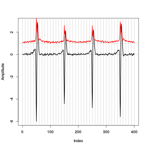
Figure 13: Robust estimates of the central event (black) and of the sample's dispersion around the central event (red) obtained with "long" (100 sampling points) cuts. We see clearly that the dispersion is almost at noise level 20 points before the peak and 30 points after the peak (on site 1).
So we decide to make our cuts with 19 points before and 30 points after our reference times (the valleys):
evts.dB <- mkEvents(sp.dB,hDdB,19,30)
It also interesting to compare within ripples with out of ripples events:
evts.dB.in <- mkEvents(sp.dB[sp.dB %in% idxRipple],hDdB,19,30)
evts.dB.in.med <- median(evts.dB.in)
evts.dB.in.mad <- apply(evts.dB.in,1,mad)
evts.dB.out <- mkEvents(sp.dB[!sp.dB %in% idxRipple],hDdB,19,30)
evts.dB.out.med <- median(evts.dB.out)
evts.dB.out.mad <- apply(evts.dB.out,1,mad)
A comparison of the central / median event is instructive here:
out.upr <- evts.dB.out.med+2*evts.dB.out.mad/sqrt(dim(evts.dB.out)[2])
out.lwr <- evts.dB.out.med-2*evts.dB.out.mad/sqrt(dim(evts.dB.out)[2])
ylim <- range(c(out.upr,out.lwr,evts.dB.in.med))
plot(evts.dB.in.med,type="l",col=1,lwd=2,ylim=ylim)
lines(out.upr,
      col=2,lwd=1)
lines(out.lwr,
      col=2,lwd=1)
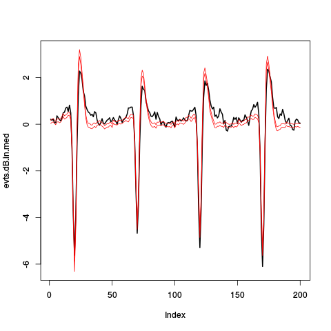
Figure 14: Robust estimates of the central event within ripples (black) and pointwise 95% confidence interval for the robust estimate of the central event out of ripples (red).
5.1.2 First jitter cancellation
We realign each event on the overall central (median) event:
evts.dBo2 <- alignWithProcrustes(sp.dB,hDdB,19,30,maxIt=5,plot=TRUE)
Template difference: 1.696, tolerance: 1
_______________________
Template difference: 0.752, tolerance: 1
_______________________
A plot of the first 500 aligned events is obtained with:
evts.dBo2[,1:500]
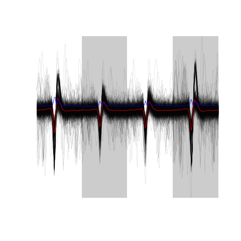
Figure 15: The overall median aligned events' sample (first 500 events) obtained from the low-pass subtracted first derivative.
5.1.3 Noise
We cut noise "events" in between "proper events":
noise.dB <- mkNoise(sp.dB,hDdB,19,30,safetyFactor=3,2000)
5.1.4 Clean events
Since we have few superpositions apparent on our events' plot, we are going to get ride of the most obvious ones:
goodEvtsFct <- function(samp,thr=4,deriv.thr=0.1) {
  nbS <- attr(samp,"numberOfSites")
  cl <- dim(samp)[1]/nbS
  samp <- unclass(samp)
  samp.med <- apply(samp,1,median)
  samp.med.mat <- matrix(samp.med,nc=nbS)
  samp.med.D.mat <- apply(samp.med.mat,
                          2,
                          function(x) c(0,diff(x,2)/2,0)
                          )
  samp.med.D.mat <- apply(samp.med.D.mat,
                          2,
                          function(x) abs(x)/max(abs(x))
                          )
  firstAbove <- apply(samp.med.D.mat,
                      2,
                      function(x) min((1:cl)[x >= deriv.thr])
                      )
  lastBellow <- apply(samp.med.D.mat,
                      2,
                      function(x) max((1:cl)[x >= deriv.thr])
                      )
  firstAbove <- min(firstAbove)
  lastBellow <- max(lastBellow)
  lookAt <- rep(TRUE,cl)
  lookAt[firstAbove:lastBellow] <- FALSE
  lookAt <- rep(lookAt,nbS)
  samp <- samp-samp.med
  samp.r <- apply(samp,2,
                  function(x) {
                    x[!lookAt] <- 0
                    x
                  }
                  )
  apply(samp.r,2,function(x) all(abs(x)<thr))
}
We can check how the number of "good" (i.e., classified as not superposed) events changes with the threshold:
sapply(3:10,function(i) sum(goodEvtsFct(evts.dBo2,i)))
[1] 383 804 941 989 1018 1030 1050 1063
We start with a threshold of 6:
good.dB <- goodEvtsFct(evts.dBo2,6)
We can look at the good events:
evts.dBo2[,good.dB]
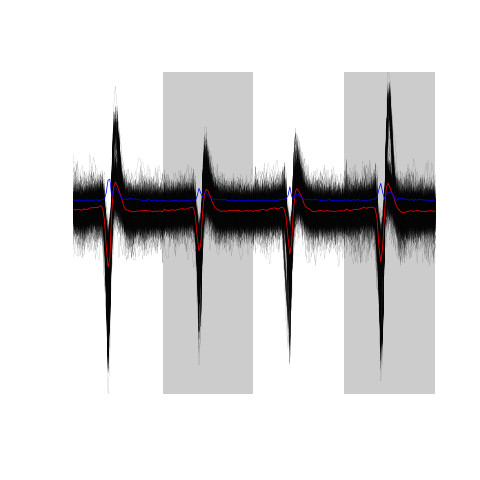
Figure 16: The sum(good.dB) 989 good events.
Now the not so good events:
evts.dBo2[,!good.dB]
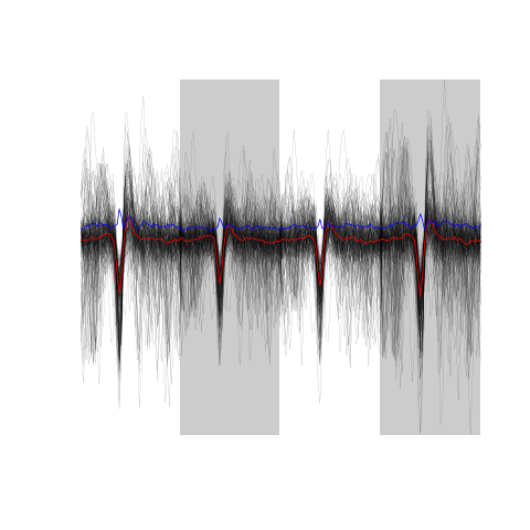
Figure 17: The sum(!good.dB) 173 not good events.
5.2 Using the high-passed version hDfir
5.2.1 Events
In order to get the cut length "right" we start with long cuts and check how long it takes for the MAD to get back to noise level:
evts.fir <- mkEvents(sp.fir,hDfir,49,50)
evts.fir.med <- median(evts.fir)
evts.fir.mad <- apply(evts.fir,1,mad)
plot(evts.fir.med,type="n",ylab="Amplitude")
abline(v=seq(0,400,10),col="grey")
abline(h=c(0,1),col="grey")
lines(evts.fir.med,lwd=2)
lines(evts.fir.mad,col=2,lwd=2)
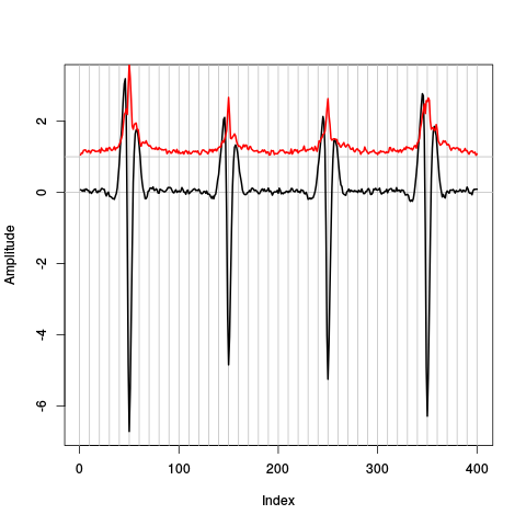
Figure 18: Robust estimates of the central event (black) and of the sample's dispersion around the central event (red) obtained with "long" (100 sampling points) cuts. We see clearly that the dispersion is almost at noise level 30 points before the peak and 40 points after the peak (on site 1).
So we decide to make our cuts with 29 points before and 40 points after our reference times (the valleys):
evts.fir <- mkEvents(sp.fir,hDfir,29,40)
5.2.2 First jitter cancellation
We realign each event on the overall central (median) event:
evts.firo2 <- alignWithProcrustes(sp.fir,hDfir,29,40,maxIt=5,plot=TRUE)
Template difference: 1.87, tolerance: 1
_______________________
Template difference: 2.188, tolerance: 1
_______________________
Template difference: 3.242, tolerance: 1
_______________________
Template difference: 2.933, tolerance: 1
_______________________
A plot of the first 500 aligned events is obtained with:
evts.firo2[,1:500]
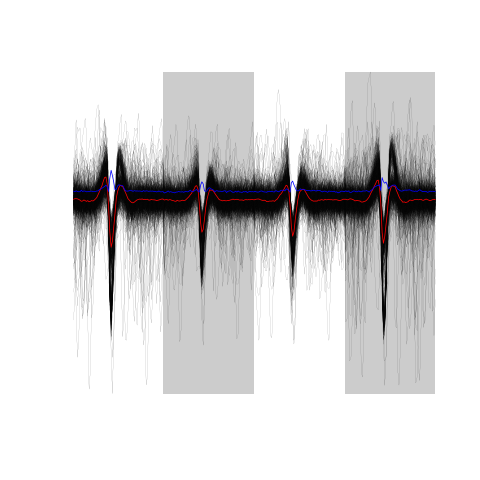
Figure 19: The overall median aligned events' sample (first 500 events) obtained from the high-passed data.
5.2.3 Noise
We cut noise "events" in between "proper events":
noise.fir <- mkNoise(sp.fir,hDfir,29,40,safetyFactor=3,2000)
5.2.4 Clean events
Since we have few superpositions apparent on our events' plot, we are going to get ride of the most obvious ones. We can check how the number of "good" (i.e., classified as not superposed) events changes with the threshold:
sapply(3:10,function(i) sum(goodEvtsFct(evts.firo2,i)))
[1] 355 722 873 926 967 994 1011 1030
We start with a threshold of 7 giving roughly the same number of good events as the threshold of 6 in the previous section:
good.fir <- goodEvtsFct(evts.firo2,7)
We can look at the good events:
evts.firo2[,good.fir]
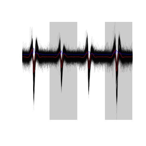
Figure 20: The sum(good.fir) 967 good events.
Now the not so good events:
evts.firo2[,!good.fir]
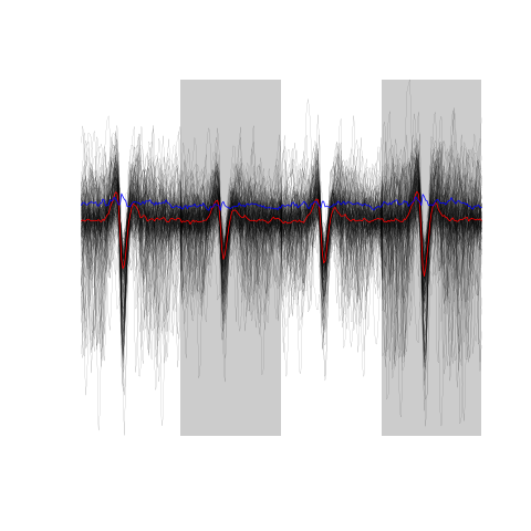
Figure 21: The sum(!good.fir) 174 not good events.
6 Dimension reduction
6.1 Using the low-pass subtracted first derivative hDdB
6.1.1 Principal component analysis
We compute the PCA decomposition using the clean guys in evts.dBo2:
evts.dB.pc <- prcomp(t(evts.dBo2[,good.dB]))
We then explore the results with function / method explore:
layout(matrix(1:4,nr=2))
explore(evts.dB.pc,1,5)
explore(evts.dB.pc,2,5)
explore(evts.dB.pc,3,5)
explore(evts.dB.pc,4,5)
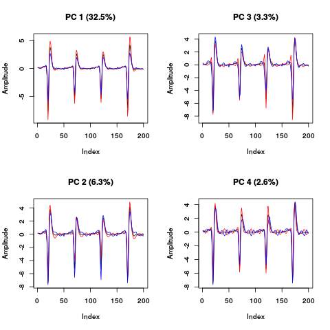
Figure 22: PCA of evts.dBo2 exploration (PC 1 to 4). Each of the 4 graphs shows the mean waveform (black), the mean waveform + 5 x PC (red), the mean - 5 x PC (blue) for each of the first 4 PCs. The fraction of the total variance "explained" by the component appears in between parenthesis in the title of each graph.
The plot suggest that the first 3 to 4 PCs should be enough since the fourth looks "wiggly" as if it were mainly noise.
Another way to get an upper bound on the number of PCs to keep is to compare the sample variance to the one of the noise plus a few of the first PCs (keeping in mind here that the noise is not homogeneous due to the ripples):
round(sapply(1:10, function(i) sum(diag(cov(t(noise.dB))))+sum(evts.dB.pc$sdev[1:i]^2))-sum(evts.dB.pc$sdev^2))
[1] -103 -74 -60 -48 -37 -27 -18 -9 0 8
This suggest 9 PCs as an upper bound of the number of relevant PCs. We look next at static projections:
panel.dens <- function(x,...) {
  usr <- par("usr")
  on.exit(par(usr))
  par(usr = c(usr[1:2], 0, 1.5) )
  d <- density(x, adjust=0.5)
  x <- d$x
  y <- d$y
  y <- y/max(y)
  lines(x, y, col="grey50", ...)
}
pairs(evts.dB.pc$x[,1:6],pch=".",gap=0,diag.panel=panel.dens)
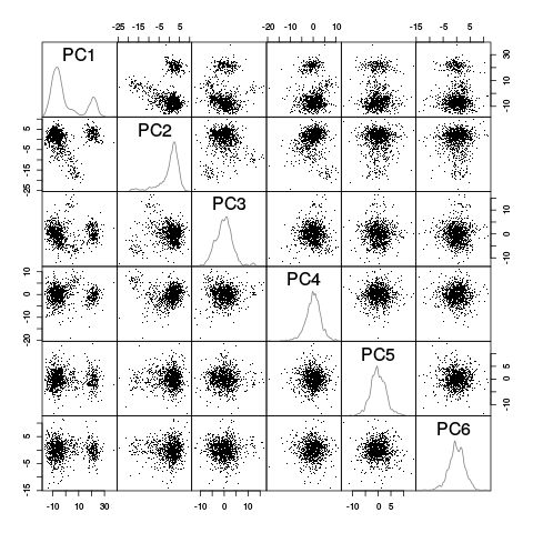
Figure 23: Scatter plot matrix of the projections of the "good" elements of evts.dBo2 onto the planes defined by the first 6 PCs. The diagonal shows a smooth (Gaussian kernel based) density estimate of the projection of the sample on the corresponding PC.
This plot suggest that the first 3 PCs should be enough and that 4 or perhaps 5 clusters are required (with 2 large ones). To confirm this analysis we export the data (first 6 PCs) in csv format and visualize them with GGobi:
write.csv(evts.dB.pc$x[,1:6],file="evts-dB.csv")
The dynamical exploration confirms the previous diagnostic 3 PCs should be enough and 4 to 5 units should be considered.
6.2 Using the high-passed version hDfir
We compute the PCA decomposition using the clean guys in evts.firo2:
evts.fir.pc <- prcomp(t(evts.firo2[,good.fir]))
We then explore the results with function / method explore:
layout(matrix(1:4,nr=2))
explore(evts.fir.pc,1,5)
explore(evts.fir.pc,2,5)
explore(evts.fir.pc,3,5)
explore(evts.fir.pc,4,5)
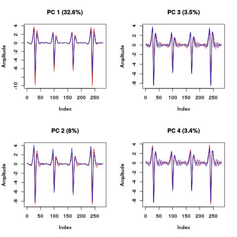
Figure 24: PCA of evts.firo2 exploration (PC 1 to 4). Each of the 4 graphs shows the mean waveform (black), the mean waveform + 5 x PC (red), the mean - 5 x PC (blue) for each of the first 4 PCs. The fraction of the total variance "explained" by the component appears in between parenthesis in the title of each graph.
The plot suggest that the first 3 to 4 PCs should be enough since the fourth looks "wiggly" as if it were mainly noise. Another way to get an upper bound on the number of PCs to keep is to compare the sample variance to the one of the noise plus a few of the first PCs (keeping in mind here that the noise is not homogeneous due to the ripples):
round(sapply(1:10, function(i) sum(diag(cov(t(noise.fir))))+sum(evts.fir.pc$sdev[1:i]^2))-sum(evts.fir.pc$sdev^2))
[1] -180 -125 -101 -78 -57 -38 -20 -5 8 22
This suggest 9 PCs as an upper bound of the number of relevant PCs. We look next at static projections:
pairs(evts.fir.pc$x[,1:6],pch=".",gap=0,diag.panel=panel.dens)
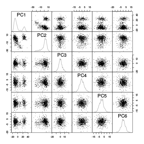
Figure 25: Scatter plot matrix of the projections of the "good" elements of evts.firo2 onto the planes defined by the first 6 PCs. The diagonal shows a smooth (Gaussian kernel based) density estimate of the projection of the sample on the corresponding PC.
This plot suggest that the first 3 PCs should be enough and that 4 or perhaps 5 clusters are required (with 2 large ones). To confirm this analysis we export the data (first 6 PCs) in csv format and visualize them with GGobi:
write.csv(evts.fir.pc$x[,1:6],file="evts-fir.csv")
The dynamical exploration confirms the previous diagnostic 3 PCs should be enough and 4 to 5 units should be considered.
7 Clustering
7.1 Using the low-pass subtracted first derivative hDdB
Inspection of the projections as well as dynamic visualization suggest that kmeans should do fine here. After trying a model with 5 units we switch to one with 6:
set.seed(20061001,kind="Mersenne-Twister")
nb.clust.dB <- 6
km.dB.res <- kmeans(evts.dB.pc$x[,1:4],
                    centers=nb.clust.dB,
                    iter.max=100,
                    nstart=100)
c.dB.res <- km.dB.res$cluster
cluster.dB.med <- sapply(1:nb.clust.dB,
                         function(cIdx) median(evts.dBo2[,good.dB][,c.dB.res==cIdx])
                         )
sizeC.dB <- sapply(1:nb.clust.dB,
                   function(cIdx) sum(abs(cluster.dB.med[,cIdx]))
                   )
newOrder.dB <- sort.int(sizeC.dB,decreasing=TRUE,index.return=TRUE)$ix
cluster.dB.mad <- sapply(1:nb.clust.dB,
                         function(cIdx) {
                          ce <- t(evts.dBo2[,good.dB])
                          ce <- ce[c.dB.res==cIdx,]
                          apply(ce,2,mad)
                        }
                        )
cluster.dB.med <- cluster.dB.med[,newOrder.dB]
cluster.dB.mad <- cluster.dB.mad[,newOrder.dB]
c.dB.res.b <- sapply(1:nb.clust.dB,
                     function(idx) (1:nb.clust.dB)[newOrder.dB==idx]
                     )[c.dB.res]
The sorted events look like:
layout(matrix(1:nb.clust.dB,nr=nb.clust.dB))
par(mar=c(1,1,1,1))
invisible(sapply(1:nb.clust.dB,
                 function(cIdx)
                 plot(evts.dBo2[,good.dB][,c.dB.res.b==cIdx],y.bar=5)
                 )
          )
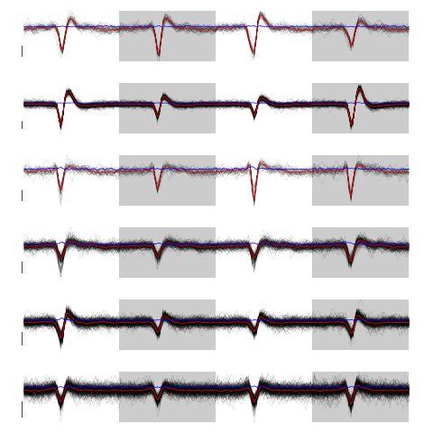
Figure 26: The 6 clusters. Cluster 1 at the top, cluster 6 at the bottom. Scale bar: 5 global MAD units. Red, cluster specific central / median event. Blue, cluster specific MAD.
Cluster 3 and 4 have some extra weird events attributed to them. That apart, things look reasonable. We check things with GGobi after generating a csv file with:
write.csv(cbind(evts.dB.pc$x[,1:6],c.dB.res.b),file="evts-dB-sorted.csv")
We can align them on their cluster center:
ujL.dB <- lapply(1:length(unique(c.dB.res.b)),
                 function(cIdx)
                 alignWithProcrustes(sp.dB[good.dB][c.dB.res.b==cIdx],hDdB,19,30)
                 )
 Template difference: 1.168, tolerance: 1
_______________________
Template difference: 0.327, tolerance: 1
_______________________
Template difference: 2.029, tolerance: 1
_______________________
Template difference: 1.106, tolerance: 1
_______________________
Template difference: 0.438, tolerance: 1
_______________________
Template difference: 1.402, tolerance: 1
_______________________
Template difference: 1.151, tolerance: 1
_______________________
Template difference: 0.828, tolerance: 1
_______________________
Template difference: 1.516, tolerance: 1
_______________________
Template difference: 0.662, tolerance: 1
_______________________
Template difference: 1.564, tolerance: 1
_______________________
Template difference: 0.822, tolerance: 1
_______________________
Template difference: 1.039, tolerance: 1
_______________________
Template difference: 0.499, tolerance: 1
_______________________
The aligned events look like:
layout(matrix(1:nb.clust.dB,nr=nb.clust.dB))
par(mar=c(1,1,1,1))
invisible(sapply(1:nb.clust.dB,
                   function(cIdx)
                   plot(ujL.dB[[cIdx]],y.bar=5)
                   )
            )
Figure 27: The 6 clusters after alignment on the clusters' centers. Cluster 1 at the top, cluster 6 at the bottom. Scale bar: 5 global MAD units. Red, cluster specific central / median event. Blue, cluster specific MAD.
We get our summary plot:
library(ggplot2)
template.med <- sapply(1:nb.clust.dB,function(i) median(ujL.dB[[i]]))
template.mad <- sapply(1:nb.clust.dB, function(i) apply(ujL.dB[[i]],1,mad))
sl <- 50
freq <- 20
nb.sites <- 4
tl <- sl*nb.sites
templateDF <- data.frame(x=rep(rep(rep((1:sl)/freq,nb.sites),nb.clust.dB),2),
                         y=c(as.vector(template.med),as.vector(template.mad)),
                         channel=as.factor(rep(rep(rep(1:nb.sites,each=sl),nb.clust.dB),2)),
                         template=as.factor(rep(rep(1:nb.clust.dB,each=tl),2)),
                         what=c(rep("mean",tl*nb.clust.dB),rep("SD",tl*nb.clust.dB))
                         )
print(qplot(x,y,data=templateDF,
            facets=channel ~ template,
            geom="line",colour=what,
            xlab="Time (ms)",
            ylab="Amplitude",
            size=I(0.5)) +
      scale_x_continuous(breaks=0:7)
      )
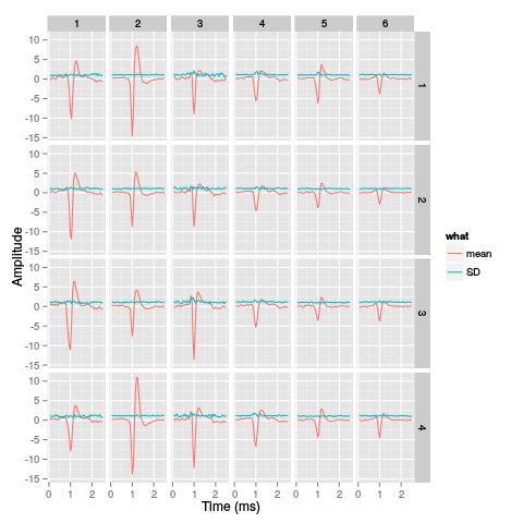
Figure 28: Summary plot with the 6 templates corresponding to the robust estimate of the mean of each cluster. A robust estimate of the clusters' SD is also shown. All graphs are on the same scale to facilitate comparison. Columns correspond to clusters and rows to recording sites.
7.2 Using the high-passed version hDfir
Based on the previous section we use kmeans clustering with 6 centers:
set.seed(20061001,kind="Mersenne-Twister")
nb.clust.fir <- 6
km.fir.res <- kmeans(evts.fir.pc$x[,1:4],
                    centers=nb.clust.fir,
                    iter.max=100,
                    nstart=100)
c.fir.res <- km.fir.res$cluster
cluster.fir.med <- sapply(1:nb.clust.fir,
                         function(cIdx) median(evts.firo2[,good.fir][,c.fir.res==cIdx])
                         )
sizeC.fir <- sapply(1:nb.clust.fir,
                   function(cIdx) sum(abs(cluster.fir.med[,cIdx]))
                   )
newOrder.fir <- sort.int(sizeC.fir,decreasing=TRUE,index.return=TRUE)$ix
cluster.fir.mad <- sapply(1:nb.clust.fir,
                         function(cIdx) {
                          ce <- t(evts.firo2[,good.fir])
                          ce <- ce[c.fir.res==cIdx,]
                          apply(ce,2,mad)
                        }
                        )
cluster.fir.med <- cluster.fir.med[,newOrder.fir]
cluster.fir.mad <- cluster.fir.mad[,newOrder.fir]
c.fir.res.b <- sapply(1:nb.clust.fir,
                     function(idx) (1:nb.clust.fir)[newOrder.fir==idx]
                     )[c.fir.res]
The sorted events look like:
layout(matrix(1:nb.clust.fir,nr=nb.clust.fir))
par(mar=c(1,1,1,1))
invisible(sapply(1:nb.clust.fir,
                 function(cIdx)
                 plot(evts.firo2[,good.fir][,c.fir.res.b==cIdx],y.bar=5)
                 )
          )
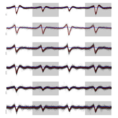
Figure 29: The 6 clusters. Cluster 1 at the top, cluster 6 at the bottom. Scale bar: 5 global MAD units. Red, cluster specific central / median event. Blue, cluster specific MAD.
Cluster 2 and 3 have some extra weird events attributed to them. That apart, things look reasonable. We check things with GGobi after generating a csv file with:
write.csv(cbind(evts.fir.pc$x[,1:6],c.fir.res.b),file="evts-fir-sorted.csv")
We can align them on their cluster center:
ujL.fir <- lapply(1:length(unique(c.fir.res.b)),
                 function(cIdx)
                 alignWithProcrustes(sp.fir[good.fir][c.fir.res.b==cIdx],hDfir,19,30)
                 )
 Template difference: 0.869, tolerance: 1
_______________________
Template difference: 0.941, tolerance: 1
_______________________
Template difference: 0.865, tolerance: 1
_______________________
Template difference: 1.052, tolerance: 1
_______________________
Template difference: 0.848, tolerance: 1
_______________________
Template difference: 1.159, tolerance: 1
_______________________
Template difference: 0.652, tolerance: 1
_______________________
Template difference: 0.902, tolerance: 1
_______________________
The aligned events look like:
layout(matrix(1:nb.clust.fir,nr=nb.clust.fir))
par(mar=c(1,1,1,1))
invisible(sapply(1:nb.clust.fir,
                   function(cIdx)
                   plot(ujL.fir[[cIdx]],y.bar=5)
                   )
            )
Figure 30: The 6 clusters after alignment on the clusters' centers. Cluster 1 at the top, cluster 6 at the bottom. Scale bar: 5 global MAD units. Red, cluster specific central / median event. Blue, cluster specific MAD.
We get our summary plot:
library(ggplot2)
template.med <- sapply(1:nb.clust.fir,function(i) median(ujL.fir[[i]]))
template.mad <- sapply(1:nb.clust.fir, function(i) apply(ujL.fir[[i]],1,mad))
sl <- 50
freq <- 20
nb.sites <- 4
tl <- sl*nb.sites
templateDF <- data.frame(x=rep(rep(rep((1:sl)/freq,nb.sites),nb.clust.fir),2),
                         y=c(as.vector(template.med),as.vector(template.mad)),
                         channel=as.factor(rep(rep(rep(1:nb.sites,each=sl),nb.clust.fir),2)),
                         template=as.factor(rep(rep(1:nb.clust.fir,each=tl),2)),
                         what=c(rep("mean",tl*nb.clust.fir),rep("SD",tl*nb.clust.fir))
                         )
print(qplot(x,y,data=templateDF,
            facets=channel ~ template,
            geom="line",colour=what,
            xlab="Time (ms)",
            ylab="Amplitude",
            size=I(0.5)) +
      scale_x_continuous(breaks=0:7)
      )
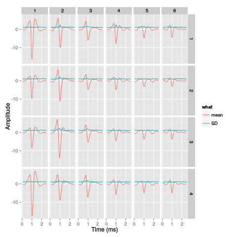
Figure 31: Summary plot with the 6 templates corresponding to the robust estimate of the mean of each cluster. A robust estimate of the clusters' SD is also shown. All graphs are on the same scale to facilitate comparison. Columns correspond to clusters and rows to recording sites.