Analysis of d533101 Data Set
Table of Contents
Sys.setlocale(category="LC_MESSAGES",locale="C")
[1] "C"
1 The data
1.1 Location and origin
I will assume that the data set is contained in file d533101.dat.gz part of a freely available data set (after registration) from the Collaborative Research in Computational Neuroscience (CRCNS) web site. They are located in folder hc-1.
1.2 Information about the data
This data set was contributed by Gyorgy Buzsáki lab, Rutgers University. The data set is made of recordings on 8 channels:
- channels 2, 3, 4 and 5 are the four recording sites of a tetrode
- channel 6 is an intracellular recording from one of the neurons recorded by the tetrode.
The sampling rate was 10 kHz. This stuff is what is reported in the README.txt file associated with the data.
1.3 Loading the data
The data are simply loaded, once we know where to find them and if we do not forget that they have been compressed with gzip. We will assume here that the data are located in R's working directory:
dN <- "d533101.dat.gz"
nb <- 8*10000000
mC <- gzfile(dN,open="rb")
d1 <- matrix(readBin(mC,what="int",size=2,n=nb),nr=8)
close(mC)
We can check that we have loaded the whole set since in that case the number of columns of our matrix d1 should be smaller than 10e6:
dim(d1)
[1] 8 2400256
So everthing was loaded. In terms of recording duration we get (in minutes):
dim(d1)[2]/1e4/60
[1] 4.000427
We can quickly check that we did not commit any major mistake while loading the data by looking at one second of intracellular trace in the middle of the set:
plot(window(ts(d1[6,],start=0,freq=1e4),120,130),ylab="",xlab="Time (s)",main="")
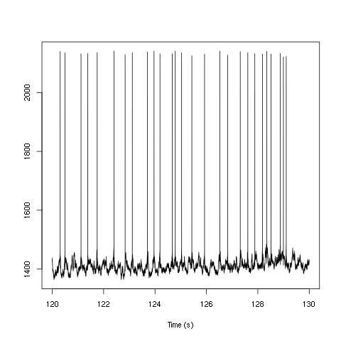
Figure 1: Ten seconds of recording of channel 6 (the intracellular channel) of data set d533101. The snapshot is from the central part of the recording.
We do the same for the extracellular channels, except that for clarity we plot only one second of data since they are not high-pass filtered:
plot(window(ts(t(d1[2:5,]),start=0,freq=1e4),120,121),ylab="",xlab="Time (s)",main="")
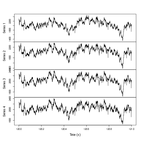
Figure 2: One second of recording of channels 2 to 5 (the tetrode channels) of data set d533101. The snapshot is from the central part of the recording.
1.4 Five numbers data summary
We get our classical five numbers plus mean data summary:
summary(t(d1[2:6,]))
| V1 | V2 | V3 | V4 | V5 |
|---|---|---|---|---|
| Min. :1093 | Min. :1152 | Min. :1185 | Min. :1204 | Min. :1114 |
| 1st Qu.:1909 | 1st Qu.:1929 | 1st Qu.:1926 | 1st Qu.:1929 | 1st Qu.:1391 |
| Median :2050 | Median :2049 | Median :2046 | Median :2048 | Median :1415 |
| Mean :2050 | Mean :2050 | Mean :2049 | Mean :2049 | Mean :1415 |
| 3rd Qu.:2191 | 3rd Qu.:2170 | 3rd Qu.:2170 | 3rd Qu.:2167 | 3rd Qu.:1442 |
| Max. :2979 | Max. :2833 | Max. :2848 | Max. :2836 | Max. :2193 |
We see that the four extracellular channels making the tetrode (columns labeled V1 to V4 in the above table) have similar summaries. The summary of the intracellular channel follows a different pattern (column V5). Given the maximal values observed we can guess that the A/D card used was probably a 12 bit one.
1.5 Data selection for generative model estimation
We are going to work with the first minute of acquired data to estimate our generative model:
hDd <- window(ts(t(d1[2:5,]),start=0,freq=1e4),0,60)
rm(d1)
Here we also remove our big d1 matrix in order to save memory.
2 The software
We start by loading file sorting.R containing the sorting specific functions from the web. These functions will soon be organized as a "propoper" R package. The URL of the file is https://raw.github.com/christophe-pouzat/Neuronal-spike-sorting/master/code/sorting.R so the loading is done by downloading the source file first from its url:
"https://raw.github.com/christophe-pouzat/Neuronal-spike-sorting/master/code/sorting.R"
https://raw.github.com/christophe-pouzat/Neuronal-spike-sorting/master/code/sorting.R
to a file named, guess what:
"sorting.R"
sorting.R
using function download.file setting the optional argument method to wget since we are downloading from an https:
download.file(url="<<code-url()>>",destfile="<<code-name()>>",method="wget")
0
The functions defined in the file can then be made accessible from the R workspace – assuming that R has been started from the directory where the previous download took place – with the following R command:
source("<<code-name()>>")
3 Data pre-processing
Since the extracellular data were not high-pass filtered, we will try to run the analysis on their derivatives since taking derivatives high-pass filters the data and reduces spike duration which is good when one deals with overlaps.
hDdd <- apply(hDd,2,function(x) c(0,diff(x,2)/2,0))
hDdd <- ts(hDdd,start=0,freq=1e4)
We get a summary of our derivatives:
summary(hDdd,digits=3)
| Series 1 | Series 2 | Series 3 | Series 4 |
|---|---|---|---|
| Min. :-2.74e+02 | Min. :-2.31e+02 | Min. :-234.0000 | Min. :-2.54e+02 |
| 1st Qu.:-7.00e+00 | 1st Qu.:-6.50e+00 | 1st Qu.: -6.5000 | 1st Qu.:-7.00e+00 |
| Median : 0.00e+00 | Median : 0.00e+00 | Median : 0.0000 | Median : 0.00e+00 |
| Mean :-4.60e-04 | Mean :-2.80e-04 | Mean : -0.0002 | Mean :-2.10e-04 |
| 3rd Qu.: 7.00e+00 | 3rd Qu.: 6.50e+00 | 3rd Qu.: 6.5000 | 3rd Qu.: 7.00e+00 |
| Max. : 3.12e+02 | Max. : 2.66e+02 | Max. : 265.5000 | Max. : 2.86e+02 |
And we can plot the first 10 seconds:
plot(window(hDdd,0,10),ylab="",xlab="Time (s)",main="")
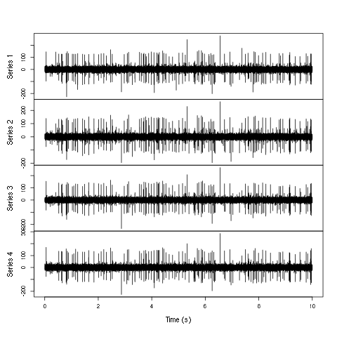
Figure 3: First 10 sec of the first derivative of recording of channels 2 to 5 (the tetrode channels) of data set d533101.
Here explore the data interactively is a must:
explore(hDdd)
3.1 Data renormalization
We are going to use a median absolute deviation (MAD) based renormalization. The goal of the procedure is to scale the raw data such that the noise SD is approximately 1. Since it is not straightforward to obtain a noise SD on data where both signal (i.e., spikes) and noise are present, we use this robust type of statistic for the SD. Luckily this is simply obtained in R:
hDdd.mad <- apply(hDdd,2,mad)
hDdd <- t(t(hDdd)/hDdd.mad)
hDdd <- ts(hDdd,start=0,freq=1e4)
where the last line of code ensures that hDdd is still an mts object. We can check on a plot how MAD and SD compare:
plot(window(hDdd[,1],0,0.2))
abline(h=c(-1,1),col=2)
abline(h=c(-1,1)*sd(hDdd[,1]),col=4,lty=2,lwd=2)
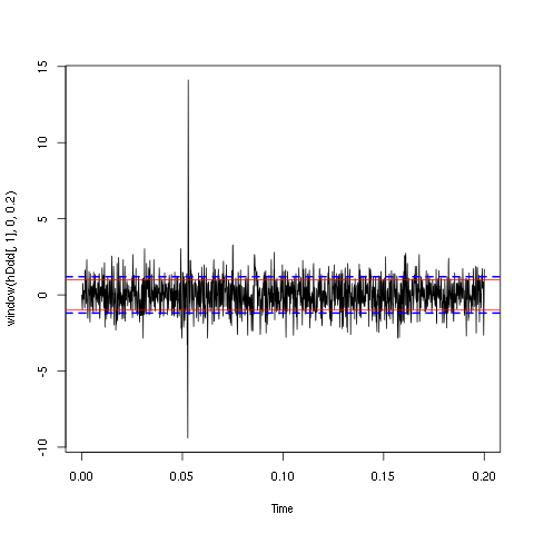
Figure 4: First 200 ms on site 1 of the derivative of data set d533101. In red: +/- the MAD; in dashed blue +/- the SD.
3.2 A quick check that the MAD "does its job"
We can check that the MAD does its job as a robust estimate of the noise standard deviation by looking at the fraction of samples whose absolute value is larger than a multiple of the MAD and compare this fraction to the expected one for a normal distribution whose SD equals the empirical MAD value:
hDddQ <- apply(hDdd,2,quantile, probs=seq(0.01,0.99,0.01))
hDddnormSD <- apply(hDdd,2,function(x) x/sd(x))
hDddnormSDQ <- apply(hDddnormSD,2,quantile, probs=seq(0.01,0.99,0.01))
qq <- qnorm(seq(0.01,0.99,0.01))
matplot(qq,hDddQ,type="n",xlab="Normal quantiles",ylab="Empirical quantiles")
abline(0,1,col="grey70",lwd=3)
col=c("black","orange","blue","red")
matlines(qq,hDddnormSDQ,lty=2,col=col)
matlines(qq,hDddQ,lty=1,col=col)
rm(hDddnormSD,hDddnormSDQ)
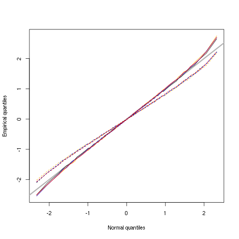
Figure 5: Performances of MAD based vs SD based normalizations. After normalizing the data of each recording site by its MAD (plain colored curves) or its SD (dashed colored curves), Q-Q plot against a standard normal distribution were constructed. Colors: site 1, black; site 2, orange; site 3, blue; site 4, red.
We see that the behavior of the "away from normal" fraction is more homogeneous for small, as well as for large in fact, quantile values with the MAD normalized traces than with the SD normalized ones. If we consider automatic rules like the three sigmas we are going to reject fewer events (i.e., get fewer putative spikes) with the SD based normalization than with the MAD based one.
4 Spike detection and events' matrix construction
After playing around a bit with thresholds we decided to detect valleys bellow -3.5 times the MAD:
thrs <- rep(-3.5,4)
above.thrs <- t(t(hDdd) > thrs)
hDddr <- hDdd
hDddr[above.thrs] <- 0
sp1 <- peaks(apply(-hDddr,1,sum),15)
rm(hDddr)
A brief description of the detection is obtained with:
sp1
eventsPos object with indexes of 1863 events.
  Mean inter event interval: 321.88 sampling points, corresponding SD: 313.45 sampling points
  Smallest and largest inter event intervals: 8 and 2381 sampling points.
4.1 Getting the right cuts length
After detecting our spikes, we must make our cuts in order to create our events' sample. The obvious question we must first address is: How long should our cuts be? The pragmatic way to get an answer is:
- Make cuts much longer than what we think is necessary, like 25 sampling points on both sides of the detected event's time.
- Compute robust estimates of the "central" event (with the median) and of the dispersion of the sample around this central event (with the MAD).
- Plot the two together and check when does the MAD trace reach the background noise level (at 1 since we have normalized the data).
- Having the central event allows us to see if it outlasts significantly the region where the MAD is above the background noise level.
Clearly cutting beyond the time at which the MAD hits back the noise level should not bring any useful information as far a classifying the spikes is concerned. So here we perform this task as follows:
evtsE <- mkEvents(sp1,hDdd,24,25)
evtsE.med <- median(evtsE)
evtsE.mad <- apply(evtsE,1,mad)
plot(evtsE.med,type="n",ylab="Amplitude",
     ylim=range(c(evtsE.med,evtsE.mad))
     )
abline(v=seq(0,200,5),col="grey")
abline(h=c(0,1),col="grey")
lines(evtsE.med,lwd=2)
lines(evtsE.mad,col=2,lwd=2)
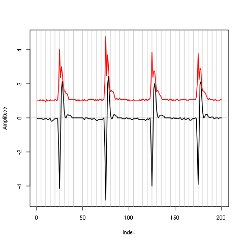
Figure 6: Robust estimates of the central event (black) and of the sample's dispersion around the central event (red) obtained with "long" (50 sampling points) cuts. We see clearly that the dispersion is back to noise level 5 points before the peak and 10 points after the peak (on all sites).
4.2 Events' matrix
We proceed with the construction of the events' matrix:
evtsE <- mkEvents(sp1,hDdd,4,10)
summary(evtsE)
events object deriving from data set: hDdd.
 Events defined as cuts of 15 sampling points on each of the 4 recording sites.
 The 'reference' time of each event is located at point 5 of the cut.
 There are 1863 events in the object.
The first 200 events look like:
evtsE[,1:200]
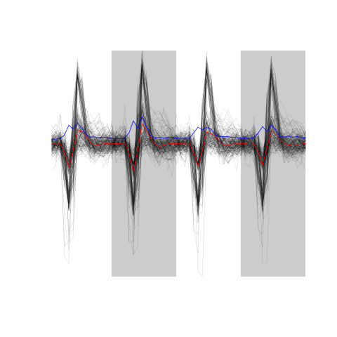
Figure 7: The first 200 events.
4.3 Noise matrix
After the events we get the noise:
noiseE <- mkNoise(sp1,hDdd,4,10,safetyFactor=2.5,2000)
summary(noiseE)
events object deriving from data set: hDdd.
 Events defined as cuts of 15 sampling points on each of the 4 recording sites.
 The 'reference' time of each event is located at point 5 of the cut.
 There are 2000 events in the object.
4.4 Events alignement on "central" event
We now align each event on the "central" event (i.e., the pointwise median of the events matrix):
evtsEo2 <- alignWithProcrustes(sp1,hDdd,4,10,maxIt=1,plot=FALSE)
summary(evtsEo2)
events object deriving from data set: hDdd.
 Events defined as cuts of 15 sampling points on each of the 4 recording sites.
 The 'reference' time of each event is located at point 5 of the cut.
 Events were realigned on median event.
 There are 1863 events in the object.
We can check the result on the first 200 events:
evtsEo2[,1:200]
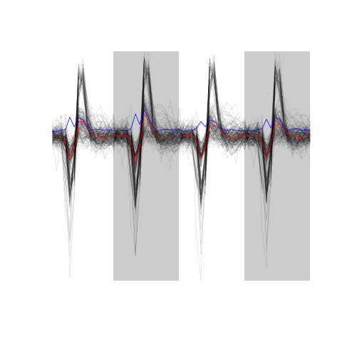
Figure 8: The first 200 aligned events.
5 Dimension reduction and clustering
5.1 Dimension reduction
Since we don't seem to have so many superposed events, we do not "clean" our sample and go directly to the PCA:
evtsE.pc <- prcomp(t(evtsEo2))
We can quickly check what the first principal components represent:
layout(matrix(1:4,nr=2))
explore(evtsE.pc,1,5)
explore(evtsE.pc,2,5)
explore(evtsE.pc,3,5)
explore(evtsE.pc,4,5)
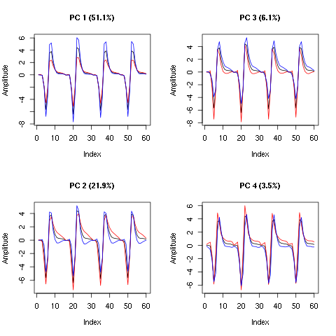
Figure 9: First four principal components computed from evtsEo2. The components are added to the mean event (black curve) after a multiplication by five (red) or minus five (blue).
We see that components 1 is an amplitude component while the next three ones are shape components. The scatter plot matrix of the loadings on the first 6 PCs is easily built:
pairs(evtsE.pc$x[,1:6],pch=".")
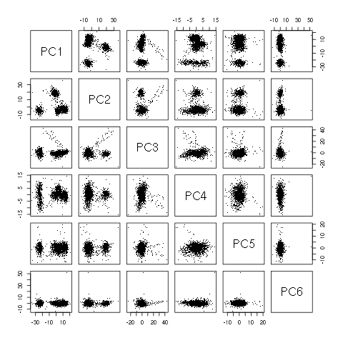
Figure 10: Scatter plot matrix of evtsEo2 loadings on the first 6 PCs.
This plot suggest that working with the first 4 PCs should be enough. We next export the data for vizualisation with GGobi:
write.csv(evtsE.pc$x[,1:6],file="evtsE.csv")
The dynamic vizualisation shows 4 clusters, two of them being rather close plus a sparse elongated structure. It also suggests that using components 5 and 6 does not bring anything. We can also get a more objective "upper bound" on the number of PCs we should use by comparing our sample variance:
sum(evtsE.pc$sdev^2)
385.056870518587
With the variance of k of the first PCs plus the noise variance:
k <- 1:10
rbind(k,
      round(sum(diag(cov(t(noiseE))))+sapply(k,
                                             function(i) sum(evtsE.pc$sdev[1:i]^2)
                                             )
            )
      )
| 1 | 2 | 3 | 4 | 5 | 6 | 7 | 8 | 9 | 10 |
| 256 | 341 | 364 | 378 | 385 | 392 | 398 | 403 | 407 | 409 |
We see that the first 5 PCs are enough to explain the extra variability of the events' sample compared to the noise.
5.2 Clustering
We cluster with kmeans using 5 clusters and the first 4 PCs:
set.seed(20061001,kind="Mersenne-Twister")
km5 <- kmeans(evtsE.pc$x[,1:4],centers=5,iter.max=100,nstart=100)
c5 <- km5$cluster
The number of events per cluster is:
sapply(1:5, function(i) sum(c5==i))
[1] 409 368 755 303 28
5.3 Cluster ordering
To facilitate comparison, we order the clusters "the usual way":
cluster.med <- sapply(1:5, function(cIdx) median(evtsEo2[,c5==cIdx]))
sizeC <- sapply(1:5,function(cIdx) sum(abs(cluster.med[,cIdx])))
newOrder <- sort.int(sizeC,decreasing=TRUE,index.return=TRUE)$ix
cluster.mad <- sapply(1:5,
                      function(cIdx) {
                        ce <- t(evtsEo2)
                        ce <- ce[c5==cIdx,]
                        apply(ce,2,mad)
                      }
                      )
cluster.med <- cluster.med[,newOrder]
cluster.mad <- cluster.mad[,newOrder]
c5b <- sapply(1:5, function(idx) (1:5)[newOrder==idx])[c5]
We write export the data with their classification for vizualiation in GGobi:
write.csv(cbind(evtsE.pc$x[,1:4],c5b),file="evtsEsorted.csv")
The classification looks great. We can next realign the events on their cluster centers:
ujL <- lapply(1:length(unique(c5b)),
              function(cIdx)
              alignWithProcrustes(sp1[c5b==cIdx],hDdd,4,10)
              )
 Template difference: 4.135, tolerance: 1
_______________________
Template difference: 3.038, tolerance: 1
_______________________
Template difference: 1.391, tolerance: 1
_______________________
Template difference: 0.685, tolerance: 1
_______________________
Template difference: 2.673, tolerance: 1
_______________________
Template difference: 1.145, tolerance: 1
_______________________
Template difference: 0.472, tolerance: 1
_______________________
Template difference: 3.945, tolerance: 1
_______________________
Template difference: 3.154, tolerance: 1
_______________________
Template difference: 3.028, tolerance: 1
_______________________
Template difference: 2.13, tolerance: 1
_______________________
Template difference: 1.882, tolerance: 1
_______________________
Template difference: 1.229, tolerance: 1
_______________________
Template difference: 1.053, tolerance: 1
_______________________
Template difference: 1.01, tolerance: 1
_______________________
Template difference: 0.833, tolerance: 1
_______________________
Template difference: 3.437, tolerance: 1
_______________________
Template difference: 1.588, tolerance: 1
_______________________
Template difference: 1.317, tolerance: 1
_______________________
Template difference: 1.308, tolerance: 1
_______________________
Template difference: 0.97, tolerance: 1
_______________________
Template difference: 1.71, tolerance: 1
_______________________
Template difference: 0.803, tolerance: 1
_______________________
We can compare the classified events before and after alignment on their cluster centers:
layout(matrix(1:2,nc=2))
par(mar=c(1,1,1,1))
evtsEo2[,c5b==1][,1:200]
ujL[[1]][,1:200]
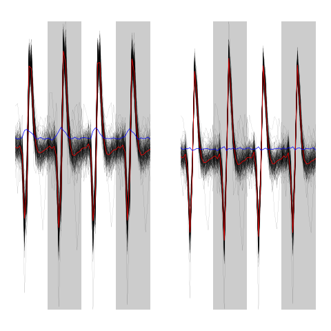
Figure 11: First 200 events of cluster 1 before (left) and after (right) alignment on cluster center.
layout(matrix(1:2,nc=2))
par(mar=c(1,1,1,1))
evtsEo2[,c5b==2][,1:200]
ujL[[2]][,1:200]
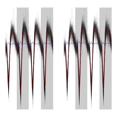
Figure 12: First 200 events of cluster 2 before (left) and after (right) alignment on cluster center.
layout(matrix(1:2,nc=2))
par(mar=c(1,1,1,1))
evtsEo2[,c5b==3]
ujL[[3]]
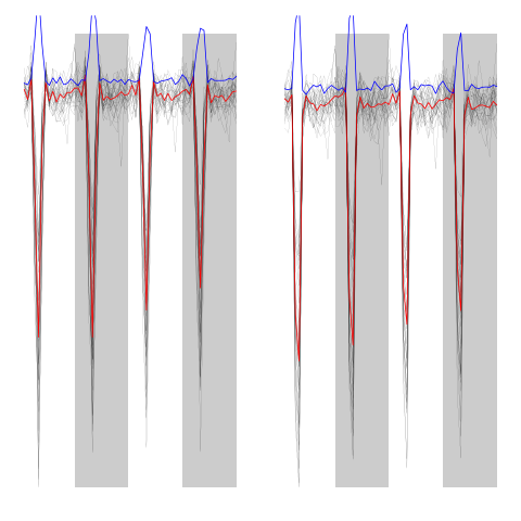
Figure 13: Events of cluster 3 before (left) and after (right) alignment on cluster center.
layout(matrix(1:2,nc=2))
par(mar=c(1,1,1,1))
evtsEo2[,c5b==4][,1:200]
ujL[[4]][,1:200]
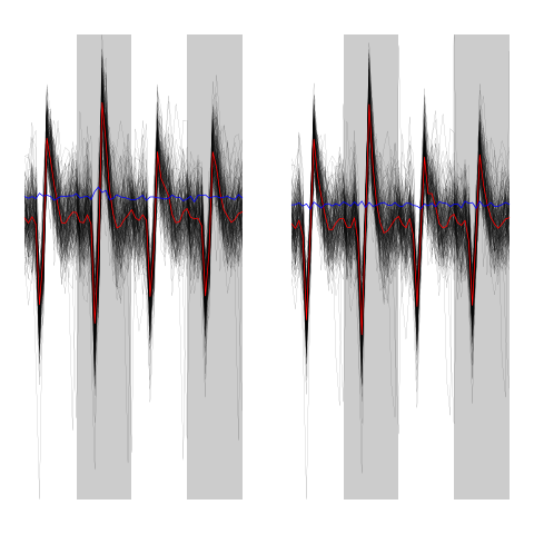
Figure 14: First 200 events of cluster 4 before (left) and after (right) alignment on cluster center.
layout(matrix(1:2,nc=2))
par(mar=c(1,1,1,1))
evtsEo2[,c5b==5][,1:200]
ujL[[5]][,1:200]
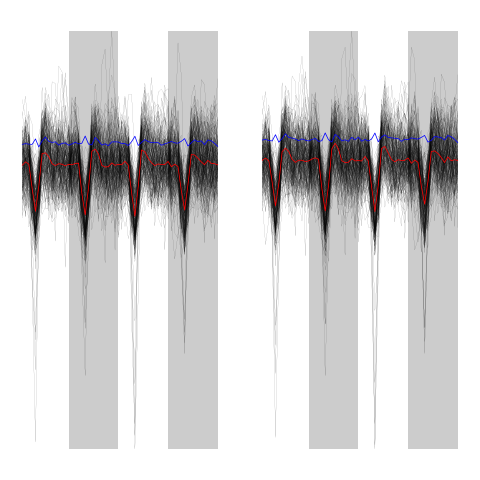
Figure 15: First 200 events of cluster 5 before (left) and after (right) alignment on cluster center.
We can now generate our summary plot:
library(ggplot2)
template1E.med <- sapply(1:5,function(i) median(ujL[[i]]))
template1E.mad <- sapply(1:5, function(i) apply(ujL[[i]],1,mad))
template1EDF <- data.frame(x=rep(rep(rep((1:15)/10,4),5),2),
                         y=c(as.vector(template1E.med),as.vector(template1E.mad)),
                         channel=as.factor(rep(rep(rep(1:4,each=15),5),2)),
                         template1E=as.factor(rep(rep(1:5,each=60),2)),
                         what=c(rep("mean",60*5),rep("SD",60*5))
                         )
print(qplot(x,y,data=template1EDF,
            facets=channel ~ template1E,
            geom="line",colour=what,
            xlab="Time (ms)",
            ylab="Amplitude",
            size=I(0.5)) +
      scale_x_continuous(breaks=0:3)
      )
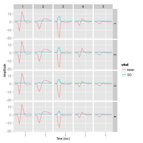
Figure 16: Summary plot of the templates obtained after alignment. Template 3 corresponds to an artifact.