Analysis of Purkinje Cells Data Set
Table of Contents
- 1. Information on the recording setting
- 2. How to proceed?
- 3. Preliminary Analysis
- 4. Data normalization
- 5. What recording sites should be processed together?
- 6. Working with derivatives?
- 7. Analysis of stereode 1
- 7.1. Model estimation from the first 20 s of data
- 7.1.1. Events detection
- 7.1.2. Getting the "right" length for the cuts
- 7.1.3. Checking the benefits of working with derivatives
- 7.1.4. Building events' and noise samples
- 7.1.5. Was the split into stereodes sound ?
- 7.1.6. Events alignment on the central event
- 7.1.7. Getting clean events
- 7.1.8. Dimension reduction
- 7.1.9. Clustering
- 7.1.10. Checking clustering results
- 7.1.11. Conclusion on this first clustering phase
- 7.1.12. Cluster specific events realignment
- 7.1. Model estimation from the first 20 s of data
Sys.setlocale(category="LC_MESSAGES",locale="C")
[1] "C"
1 Information on the recording setting
The four traces were recorded simultaneously from the first four recording sites of what is now commercialized as model A 1 X 16 - 3mm - 50 - 177 by NeuroNexus. These four linearly arranged (50 μ m apart) recording sites do not have the configuration of a tetrode and should therefore not necessarily be processed as a tetrode recording. The data were recorded by Matthieu Delescluse who brought the probe parallel to the Purkinje cells layer of a cerebellar slice. Check Fig. 4.1 p. 72 of Matthieu's thesis for a picture of the actual setting. Experimental details can be found in Sec. 4 of his thesis as well as in Delescluse and Pouzat (2005).
2 How to proceed?
2.1 Loading the script file
We start by loading file sorting.R containing the sorting specific functions from the web. These functions will soon be organized as a "proper" R package. The URL of the file is https://raw.github.com/christophe-pouzat/Neuronal-spike-sorting/master/code/sorting.R (now hosted on GitHub) so the loading is done with by dowloading the source file first from its url:
"https://raw.github.com/christophe-pouzat/Neuronal-spike-sorting/master/code/sorting.R"
https://raw.github.com/christophe-pouzat/Neuronal-spike-sorting/master/code/sorting.R
to a file named, guess what:
"sorting.R"
sorting.R
using function download.file setting the optional argument method to wget since we are downloading from an https:
download.file(url="<<code-url()>>",destfile="<<code-name()>>",method="wget")
0
The functions defined in the file can then be made accessible from the R workspace – assuming that R has been started from the directory where the previous download took place – with the following R command:
source("<<code-name()>>")
2.2 Loading the data
The data are simply loaded, once we know where to find them and if we do not forget that they have been compressed with gzip. The data are stored with one file per recording channel in single precision (32 bits) float format. They were sampled at 15 kHz and there is 58 s of them. Since they are compressed, we cannot read them directly into R from the depository nd we must download them first:
reposName <- "http://xtof.disque.math.cnrs.fr/data/"
dN <- paste("PK_",1:4,".fl.gz",sep="")
sapply(1:4, function(i)
       download.file(paste(reposName,dN[i],sep=""),
                     dN[i],mode="wb"))
Once the data are in our working directory we can load them into our R workspace:
nb <- 58*15000
pkD <- sapply(dN,
             function(n) {
               mC <- gzfile(n,open="rb")
               x <- readBin(mC,what="double",size=4,n=nb)
               close(mC);x})
colnames(pkD) <- paste("site",1:4)
We can check that our pkD object has the correct dimension:
dim(pkD)
[1] 850500 4
3 Preliminary Analysis
We are going to start our analysis by some "sanity checks" to make sure that nothing "weird" happened during the recording.
3.1 Five number summary
We should start by getting an overall picture of the data like the one provided by the summary method of R which outputs a 5 numbers plus mean summary. The five numbers are the minimum, the first quartile, the median, the third quartile and the maximum:
summary(pkD)
| site 1 | site 2 | site 3 | site 4 |
|---|---|---|---|
| Min. :-0.829633 | Min. :-1.610285 | Min. :-1.238575 | Min. :-0.699016 |
| 1st Qu.:-0.012665 | 1st Qu.:-0.012970 | 1st Qu.:-0.009308 | 1st Qu.:-0.009918 |
| Median : 0.005951 | Median : 0.002594 | Median : 0.006561 | Median : 0.004730 |
| Mean : 0.007070 | Mean : 0.003015 | Mean : 0.007395 | Mean : 0.005772 |
| 3rd Qu.: 0.024262 | 3rd Qu.: 0.018158 | 3rd Qu.: 0.021820 | 3rd Qu.: 0.018769 |
| Max. : 0.667277 | Max. : 1.260243 | Max. : 1.088121 | Max. : 0.581521 |
We see that the data range (maximum - minimum) changes from one recording sites, but the inter-quartiles ranges are rather similar.
3.2 Were the data normalized?
We can check next if some processing like a division by the standard deviation (SD) has been applied:
apply(pkD,2,sd)
| site 1 | 0.0643019285501082 |
| site 2 | 0.0684546253608183 |
| site 3 | 0.0820789334826497 |
| site 4 | 0.0422332055592564 |
No SD based normalization was applied to these data.
3.3 Discretization step amplitude
Since the data have been digitized we can easily obtain the apparent size of the digitization set:
apply(pkD,2, function(x) min(diff(sort(unique(x)))))
| site 1 | 0.00030517578125 |
| site 2 | 0.00030517578125 |
| site 3 | 0.00030517578125 |
| site 4 | 0.00030517578125 |
3.4 Plot the data
We are going to profit from the time series (ts and mts for multiple time series) objects of R by redefining our pkD matrix as:
pkD <- ts(pkD,start=0,freq=15e3)
It is then straightforward to plot the whole data set:
plot(pkD,xlab="Time (s)")
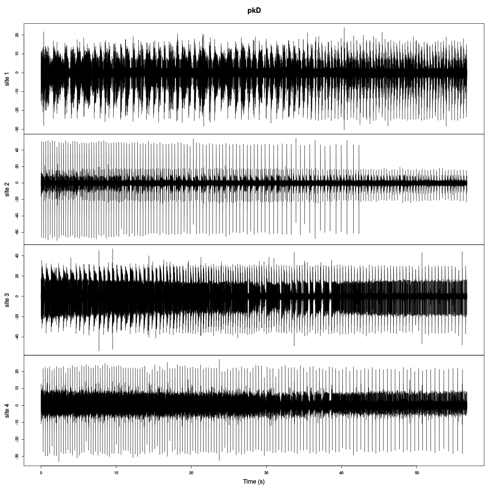
Figure 1: The whole (58 s) Purkinje cells data set.
It is also good to "zoom in" and look at the data with a finer time scale:
plot(window(pkD,start=0,end=0.2))
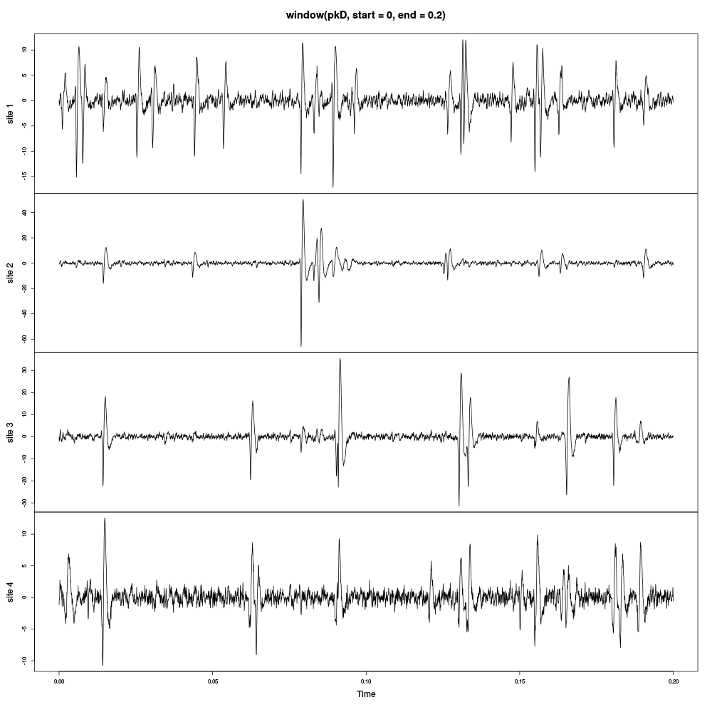
Figure 2: First 200 ms of the Purkinje cells data set.
3.5 Explore the data
As always if the person who analyses the data is not the person who recorded them or if both persons are the same but a long time went by between the recording session and the analysis, carefull examination of the raw data with a good time resolution is absolutely necessary. This is done with the explore function / method:
explore(pkD,col=c("black", "grey50"))
This examination of the data shows:
- A very large doublet to quadruplet firing cell on the second recording site. The spikes from this neuron are also visible on the first recording site. The first two spikes of the bursts give also rather small signals on the third recording site.
- A "long burst" (2 to 6 spikes) firing neuron on the third recording site. The spikes from this neuron are visible on the fourth site but not on the second.
- A neuron firing brief bursts of 3 to 4 spikes on the fourth recording site. These spikes also give tiny signals on the third recording site.
- In general the coupling between the recording sites is weak, as expected given the configuration of the electrodes (linear spacing 50 μ m apart).
- The data are rather complex with bursts firing as well as regular firing neurons.
- The first spikes in a burst exhibit mainly an amplitude modulation while the later spikes also appear slower.
4 Data normalization
4.1 MAD based normalization
We are going to use a median absolute deviation (MAD) based renormalization. The goal of the procedure is to scale the raw data such that the noise SD is approximately 1. Since it is not straightforward to obtain a noise SD on data where both signal (i.e., spikes) and noise are present, we use this robust type of statistic for the SD. Luckily this is simply obtained in R:
pkD.mad <- apply(pkD,2,mad)
pkD <- t(t(pkD)/pkD.mad)
pkD <- t(t(pkD)-apply(pkD,2,median))
pkD <- ts(pkD,start=0,freq=15e3)
where the last line of code ensures that pkD is still an mts object. We can check on a plot how MAD and SD compare:
plot(window(pkD[,1],0,0.2))
abline(h=c(-1,1),col=2)
abline(h=c(-1,1)*sd(pkD[,1]),col=4,lty=2,lwd=2)
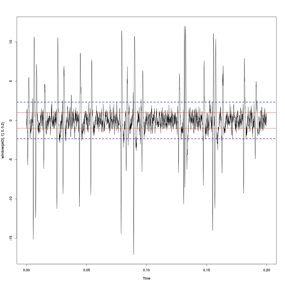
Figure 3: First 200 ms on site 1 of the Purkinje cells data set. In red: +/- the MAD; in dashed blue +/- the SD.
4.2 A quick check that the MAD "does its job"
We can check that the MAD does its job as a robust estimate of the noise standard deviation by looking at the fraction of samples whose absolute value is larger than a multiple of the MAD and compare this fraction to the expected one for a normal distribution whose SD equals the empirical MAD value:
pkDQ <- apply(pkD,2,quantile, probs=seq(0.01,0.99,0.01))
pkDnormSD <- apply(pkD,2,function(x) x/sd(x))
pkDnormSDQ <- apply(pkDnormSD,2,quantile, probs=seq(0.01,0.99,0.01))
qq <- qnorm(seq(0.01,0.99,0.01))
matplot(qq,pkDQ,type="n",xlab="Normal quantiles",ylab="Empirical quantiles")
abline(0,1,col="grey70",lwd=3)
col=c("black","orange","blue","red")
matlines(qq,pkDnormSDQ,lty=2,col=col)
matlines(qq,pkDQ,lty=1,col=col)
rm(pkDnormSD,pkDnormSDQ)
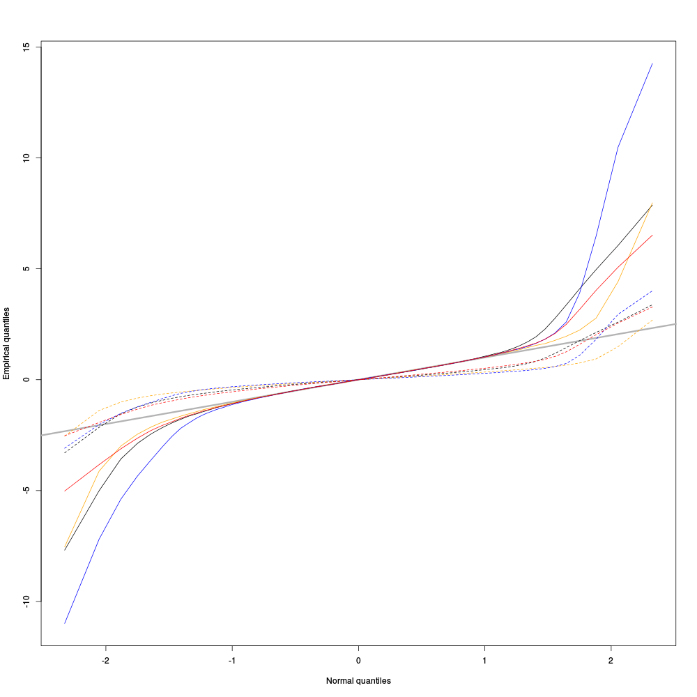
Figure 4: Performances of MAD based vs SD based normalizations. After normalizing the data of each recording site by its MAD (plain colored curves) or its SD (dashed colored curves), Q-Q plot against a standard normal distribution were constructed. Colors: site 1, black; site 2, orange; site 3, blue; site 4, red.
We see that the behavior of the "away from normal" fraction is much more homogeneous for small, as well as for large in fact, quantile values with the MAD normalized traces than with the SD normalized ones. If we consider automatic rules like the three sigmas we are going to reject fewer events (i.e., get fewer putative spikes) with the SD based normalization than with the MAD based one.
5 What recording sites should be processed together?
As mentioned in the first section the four recording sites from which the data were obtained do not form a tetrode. They were positioned along a line 50 μ m apart, implying that there is 150 μ m between the first and fourth recording sites. We should perhaps not expect that these extreme sites recorded the "same" activity. It could therefore make sense in term of computational speed as well as, not to say especially, to reduce the occurrence of superpositions to process them as several groups. The question becomes then: how should we group the site?
5.1 Cross-correlation functions of rectified data
One way to address the previous question is to "strip" the data from the noise, by forcing everything with an absolute value smaller than a given threshold to zero, before computing cross-correlation functions. If two sites "see" partly the same activity (the same neurons), their cross-correlation functions should be large at, and close to, lag zero. Our last figure exploring the performance of the MAD normalized data suggest that using a threshold of 4 times the MAD on each recording site should do the job. So let's try that:
pkDr <- pkD
pkDr[pkD<=4] <- 0
acf(pkDr)
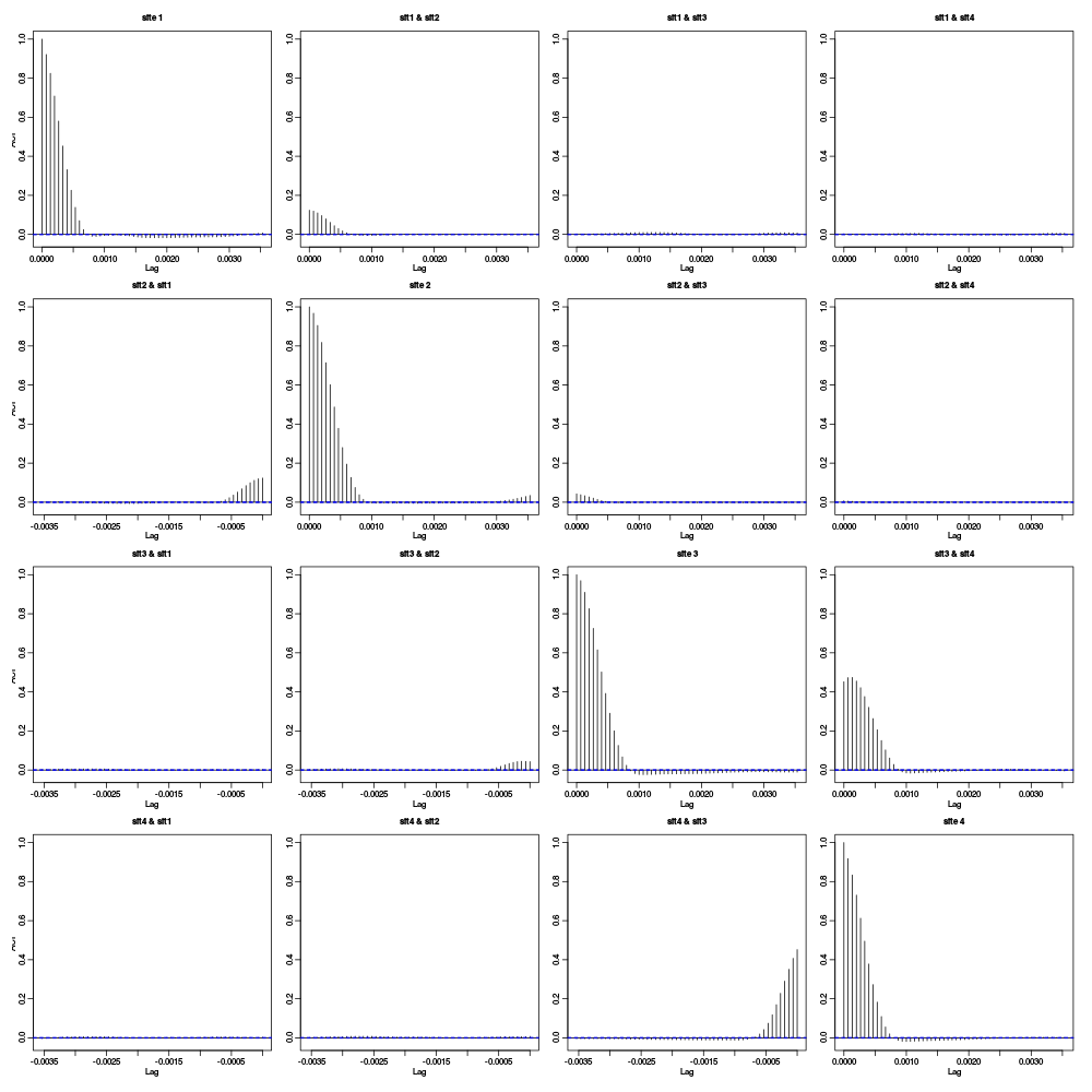
Figure 5: Auto- and cross-correlation functions of the "rectified" traces. That is of the data were everything with an absolute value smaller than 4 times the MAD was forced at zero.
5.2 Conclusions
The figure shows that the activities of site 1 and site 4 are uncorrelated (at least at that level of analysis). The same goes for site 1 and site 3. There is moreover only a relatively small correlation between the activities on site 2 and 3. These results suggest processing the data of these four sites as two stereodes, one made of sites 1 and 2, the other made of sites 3 and 4. We could moreover expect to have 1 or 2 units in common between the two stereodes due to the weak cross-correlation between sites 2 and 3.
The reader is invited to check for himself that the chosen threshold does not influence this analysis at least in the 3 to 5 range.
6 Working with derivatives?
A quick inspection of the data with, for the first stereode:
explore(pkD[,1:2])
shows that some spikes are rather long lasting. This creates a potential problem since the longer the spike waveforms, the more likely we are to find superposed events. We would therefore be interested in finding a way to make our events shorter. Working with derivatives can do that for us.
6.1 Getting derivatives
We get derivatives very simply as follows:
pkDd <- apply(pkD,2,function(x) c(0,diff(x,2),0))
pkDd <- ts(pkDd,start=0,freq=15e3)
Do be precise, we get traces proportional to the derivatives here. We should divide them by 2 times the sampling rate in order to get true derivatives.
6.2 Comparing derivatives with raw data
We can compare interactively the raw data with their derivatives on the first stereode as follows (alternating raw trace and derivative on a given channel):
explore(cbind(pkD[,1],pkDd[,1],pkD[,2],pkDd[,2]),col=c("black","grey"))
For clarity we also alternate the colors, black for the raw data and grey for their derivatives. We can also generate a static plot:
plot(window(cbind("site 1"=pkD[,1],"site 1 deriv"=pkDd[,1],
                  "site 2"=pkD[,2],"site 2 deriv"=pkDd[,2]),
            0.62,0.72),
     xlab="Time (s)",main="Raw vs Deriv. Comp.")
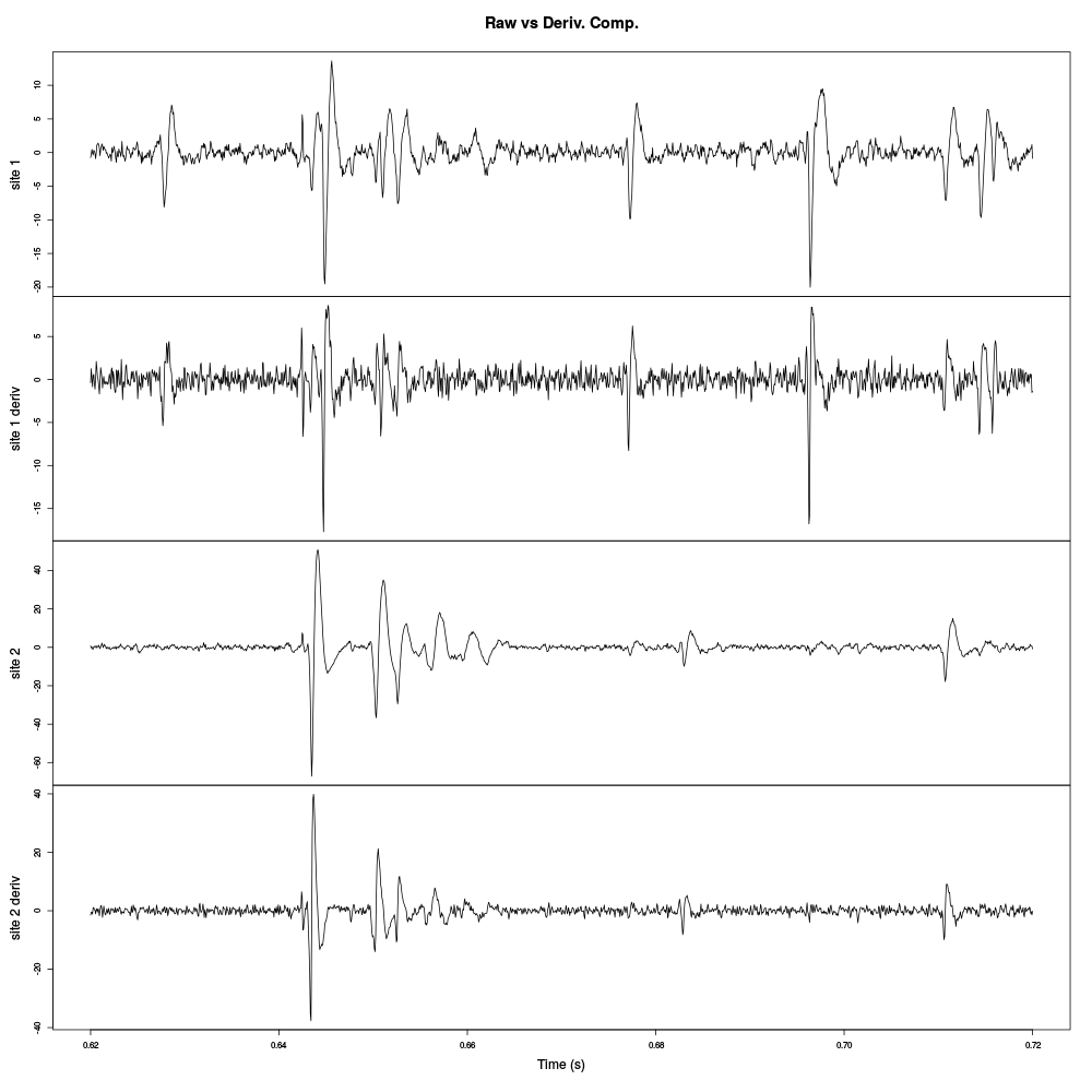
Figure 6: Raw data and their derivatives for the first stereode (made of sites 1 and 2).
The burst between t=0.64 and t=0.66 is much better "defined" on the derivative of site 2 traces than on the raw trace. Events are systematically shorter on the derivatives than on the raw traces. The background noise level is also slightly increased on the derivatives since each of their point is obtained by subtracting two values of the raw trace (therefore, ignoring noise auto-correlation, the noise SD is multiplied by \(\sqrt{2}\)).
7 Analysis of stereode 1
7.1 Model estimation from the first 20 s of data
After normalizing the derivative data to their MAD we create a new time series object containing only the first pair of recording sites and only the first 20 s of data.
pkDd.mad <- apply(pkDd,2,mad)
pkDd <- t(t(pkDd)/pkDd.mad)
pkDd <- t(t(pkDd)-apply(pkDd,2,median))
pkDd <- ts(pkDd,start=0,freq=15e3)
stereo1E <- window(pkDd[,1:2],0,20)
It is a good idea at this stage if your working on a computer with a relatively small RAM size, like a netbook, to keep only the data we are going to work with:
rm(pkD,pkDd)
7.1.1 Events detection
For this data set finding the "right" detection direction (i.e., peak or valley), threshold and exclusion length turned out to be slightly tricky. Going back and forth between detection and checks with commands like:
stereo1Er <- stereo1E
stereo1Er[stereo1E>-4] <- 0
stereo1Er <- ts(stereo1Er,start=0,freq=15e3)
(sp1E <- peaks(apply(-stereo1Er,1,sum),15))
explore(sp1E,stereo1E,col=c("black","grey50"))
For a detection of valleys (negative peaks) with a minimal value smaller than -4 times the MAD with an exclusion period of 8 points (half of the second argument of function peaks).
stereo1Er <- stereo1E
stereo1Er[stereo1E < 4] <- 0
stereo1Er <- ts(stereo1Er,start=0,freq=15e3)
(sp1E <- peaks(apply(stereo1Er,1,sum),25))
explore(sp1E,stereo1E,col=c("black","grey50"))
For a detection of peaks with a maximal value larger than 4 times the MAD with an exclusion period of 13 points (half of the second argument of function peaks).
The following combinations of threshold and exclusion period were tried for valleys: (-4,15), (-5,15), (-4,45) while the combination for peaks were: (4,15), (5,20), (4,25) and the last which was judged "good enough" with a threshold at 3.5 and an exclusion period at 15:
stereo1Er <- stereo1E
stereo1Er[stereo1E < 3.5] <- 0
stereo1Er <- ts(stereo1Er,start=0,freq=15e3)
sp1E <- peaks(apply(stereo1Er,1,sum),30)
rm(stereo1Er)
Giving
sp1E
eventsPos object with indexes of 1945 events.
  Mean inter event interval: 154.28 sampling points, corresponding SD: 168.89 sampling points
  Smallest and largest inter event intervals: 15 and 2726 sampling points.
Which was checked in the usual way:
explore(sp1E,stereo1E,col=c("black","grey50"))
7.1.2 Getting the "right" length for the cuts
After detecting our spikes, we must make our cuts in order to create our events' sample. The obvious question we must first address is: How long should our cuts be? The pragmatic way to get an answer is:
- Make cuts much longer than what we think is necessary, like 50 sampling points on both sides of the detected event's time.
- Compute robust estimates of the "central" event (with the
median) and of the dispersion of the sample around this central event (with theMAD). - Plot the two together and check when does the
MADtrace reach the background noise level (at 1 since we have normalized the data). - Having the central event allows us to see if it outlasts significantly the region where the
MADis above the background noise level.
Clearly cutting beyond the time at which the MAD hits back the noise level should not bring any useful information as far a classifying the spikes is concerned. So here we perform this task as follows:
evtsE <- mkEvents(sp1E,stereo1E,49,50)
evtsE.med <- median(evtsE)
evtsE.mad <- apply(evtsE,1,mad)
plot(evtsE.med,type="n",ylab="Amplitude")
abline(v=seq(0,200,5),col="grey")
abline(h=c(0,1),col="grey")
lines(evtsE.med,lwd=2)
lines(evtsE.mad,col=2,lwd=2)
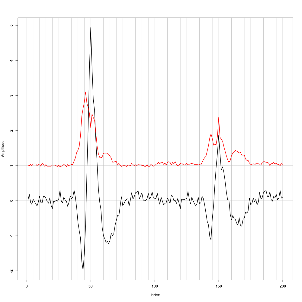
Figure 7: Robust estimates of the central event (black) and of the sample's dispersion around the central event (red) obtained with "long" (100 sampling points) cuts. We see clearly that the dispersion is back to noise level 15 points before the peak and 25 points after the peak (on site 2).
The figure clearly shows that starting the cuts 15 points before the peak and ending them 25 points after should fulfill our goals. We also see that the central event slightly outlasts the window where the MAD is larger than 1.
7.1.3 Checking the benefits of working with derivatives
When we compared the raw data and their derivatives, we saw that the latter exhibit shorter duration events. This fact was our main reason do work with the derivatives instead of the raw data. We can now directly check this "shortening of events" effect by making cuts on the raw data, exactly in the way we did on the derivatives:
evtsEb <- mkEvents(sp1E,pkD[,1:2],49,50)
evtsEb.med <- median(evtsEb)
evtsEb.mad <- apply(evtsEb,1,mad)
plot(evtsEb.med,type="n",ylab="Amplitude")
abline(v=seq(0,200,5),col="grey")
abline(h=c(0,1),col="grey")
lines(evtsEb.med,lwd=2)
lines(evtsEb.mad,col=2,lwd=2)
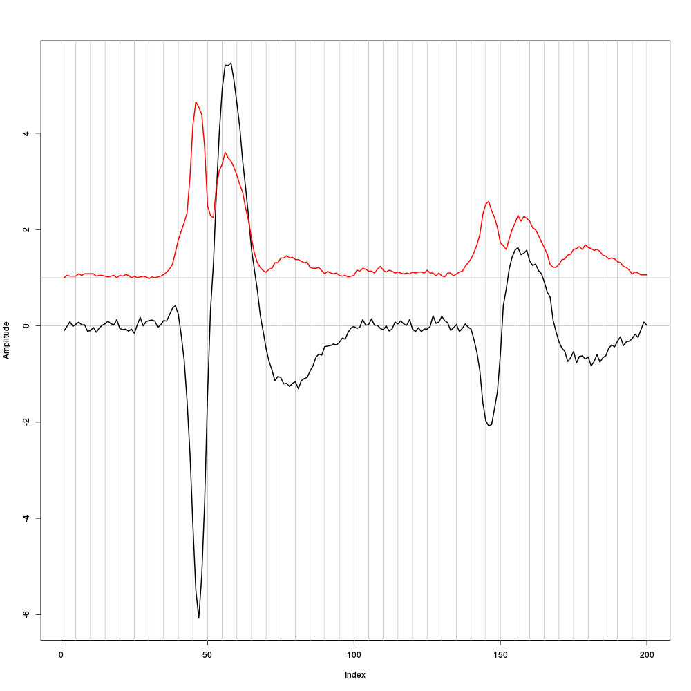
Figure 8: Case of a sample built from the raw data as opposed to their derivatives as we just did. Robust estimates of the central event (black) and of the sample's dispersion around the central event (red) obtained with "long" (100 sampling points) cuts. We see clearly that the dispersion is back to noise level 25 points before the peak and 35 points after the peak (on site 2).
Working with the raw data we would have to use cuts 60 sampling points long instead of 40 points long cut required for the derivatives. This 50 % reduction will greatly reduce the impact of superposed events. The cost could be a loss of information.
7.1.4 Building events' and noise samples
Now that our cuts length are set we can proceed:
evts1E <- mkEvents(sp1E,stereo1E,14,25)
summary(evts1E)
events object deriving from data set: stereo1E.
 Events defined as cuts of 40 sampling points on each of the 2 recording sites.
 The 'reference' time of each event is located at point 15 of the cut.
 There are 1945 events in the object.
We can visualize the first 200 events in the usual way:
evts1E[,1:200]
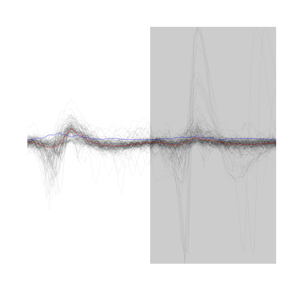
Figure 9: First 200 events of sample evts1E. Superposed in red the median of the whole sample and in blue, the MAD.
We now get the noise sample:
noise1E <- mkNoise(sp1E,stereo1E,14,25,safetyFactor=2.5,2000)
summary(noise1E)
events object deriving from data set: stereo1E.
 Events defined as cuts of 40 sampling points on each of the 2 recording sites.
 The 'reference' time of each event is located at point 15 of the cut.
 There are 2000 events in the object.
7.1.5 Was the split into stereodes sound ?
We can check at this point that we did not commit any major blunder by splitting our data set into two stereodes. The way to do this check is to create an events sample from the second stereode (the one made of sites 3 and 4) using our detected spike times sp1E. The central event of such a sample should be close to zero and its MAD should be close to 1.
evts2E <- mkEvents(sp1E,window(pkDd[,3:4],0,20),14,25)
evts2E.med <- median(evts2E)
evts2E.mad <- apply(evts2E,1,mad)
We can visualize the first 200 events in the usual way:
evts2E[,1:200]
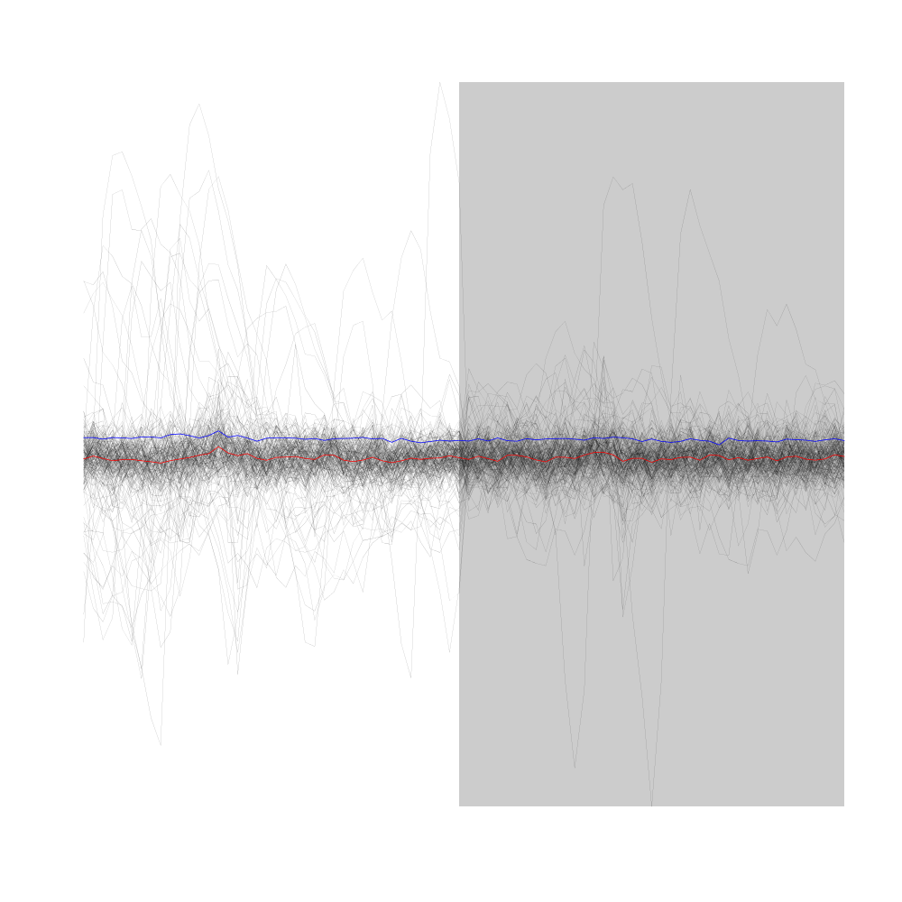
Figure 10: First 200 events of sample evts2E (events cut on stereode 2 using spike times detected on stereode 1). Superposed in red the median of the whole sample and in blue, the MAD.
The plot confirms that we are not loosing much information (as far as the discrimination of spike waveforms is concerned) by splitting our data set into two stereodes.
7.1.6 Events alignment on the central event
We compensate part of the alignment jitter:
evts1Eo2 <- alignWithProcrustes(sp1E,stereo1E,14,25,maxIt=1,plot=FALSE)
summary(evts1Eo2)
events object deriving from data set: stereo1E.
 Events defined as cuts of 40 sampling points on each of the 2 recording sites.
 The 'reference' time of each event is located at point 15 of the cut.
 Events were realigned on median event.
 There are 1945 events in the object.
We already a clear difference when we look at the first 200 aligned events:
evts1Eo2[,1:200]
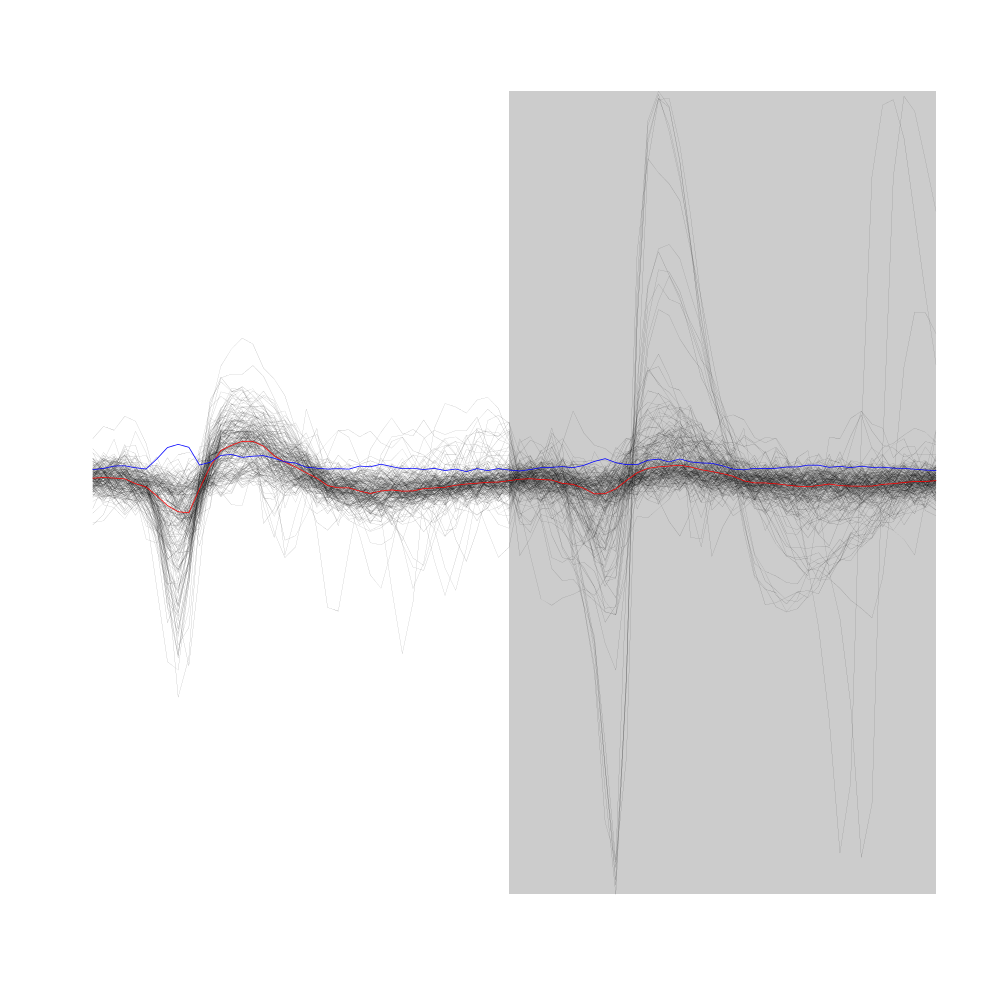
Figure 11: First 200 events of sample evts1Eo2, that is, first 200 events of sample evts1E aligned on the central event (sample median). Superposed in red the median of the whole sample and in blue, the MAD.
7.1.7 Getting clean events
We are going to use a rather "brute force" approach to preselect events as "good" or "clean" as opposed to superposed. We will take the central (median) event as a reference, find out the regions where it is negative (the two side valleys) and check in those regions if each individual event is bellow a given threshold. We simply want to detect the events exhibiting the most obvious extra peaks where the central event has a valley:
goodEvtsFct <- function(samp,thr=4) {
  samp.med <- apply(samp,1,median)
  above <- samp.med > 0
  samp.r <- apply(samp,2,
                  function(x) {
                    x[above] <- 0
                    x
                  }
                  )
  apply(samp.r,2,function(x) all(x<thr))
}
After a first attempt with a threshold set to 4 we decide to keep a threshold of 5:
goodEvts <- goodEvtsFct(evts1Eo2,5)
We therefore get:
c(total=length(goodEvts),
  good=sum(goodEvts),
  superpositions=sum(!goodEvts)
  )
total           good superpositions
  1945           1807            138
As usual we check at this stage what our selection looks (not shown in this document) with:
evts1Eo2[,goodEvts][,1:200]
evts1Eo2[,!goodEvts]
7.1.8 Dimension reduction
We perform our usual principal components analysis using function prcomp:
evts1E.pc <- prcomp(t(evts1Eo2[,goodEvts]))
We then explore the results with function / method explore:
layout(matrix(1:4,nr=2))
explore(evts1E.pc,1)
explore(evts1E.pc,2)
explore(evts1E.pc,3)
explore(evts1E.pc,4)
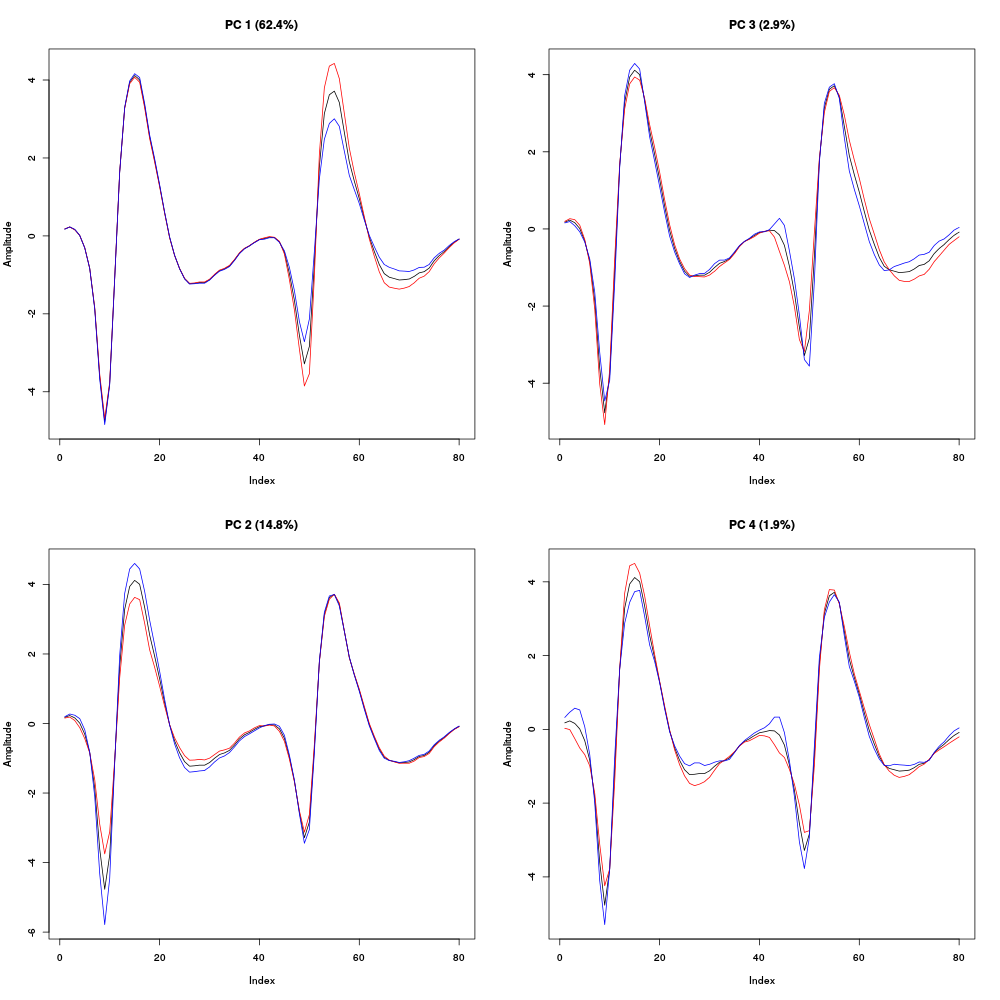
Figure 12: First four principal components computed from the "clean" events of evts1Eo2. The components are added to the mean event (black curve) after a multiplication by two (red) or minus two (blue).
We see here that the first principal component which accounts for 44 % of the total variance corresponds to an amplitude modulation on the second recording site, that is, the site which exhibits the very large doublet / triplet firing neuron. The second component accounts for 15 % of the total variance and corresponds to an amplitude modulation on the first recording site. Component 3 accounts for 3 % of the total variance and corresponds to a shape modulation on (mainly) the second recording site. Component 4 accounts for 2 % of the total variance and corresponds to a shape modulation on both recording sites. We can keep going with the next four principal components:
layout(matrix(1:4,nr=2))
explore(evts1E.pc,5)
explore(evts1E.pc,6)
explore(evts1E.pc,7)
explore(evts1E.pc,8)
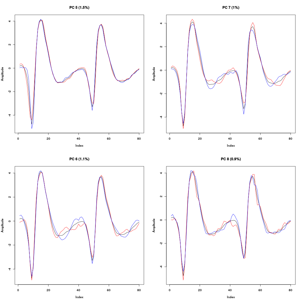
Figure 13: Principal components 5 to 8 computed from the "clean" events of evts1Eo2. The components are added to the mean event (black curve) after a multiplication by two (red) or minus two (blue).
All these components account for a small part of the total variance, between 1.5 and 1 %, correspond to mainly shape modulations and start to look much like noise. That suggest that starting the clustering using only the first four components would make sense.
If we look at the number of first PCs we should have to the noise variance in order to get the total variance of the sample of good events from evts1Eo2 we get:
round(cumsum(evts1E.pc$sdev[1:15]^2)+
      mean(apply(noise1E^2,2,sum))-
      sum(evts1E.pc$sdev^2)
      )
[1] -158 -69 -52 -40 -31 -25 -19 -13 -8 -4 1 5 9 12 15
This suggests that no more than 10 to 11 PCs are likely to bring substantial information, living the possibility that much fewer might be enough for the clustering job.
We next look at scatter plot matrices of the whole "clean" events sample projected onto planes defined by pairs of the first PCs:
panel.dens <- function(x,...) {
  usr <- par("usr")
  on.exit(par(usr))
  par(usr = c(usr[1:2], 0, 1.5) )
  d <- density(x, adjust=0.5)
  x <- d$x
  y <- d$y
  y <- y/max(y)
  lines(x, y, col="grey50", ...)
}
pairs(evts1E.pc$x[,1:4],pch=".",gap=0,diag.panel=panel.dens)
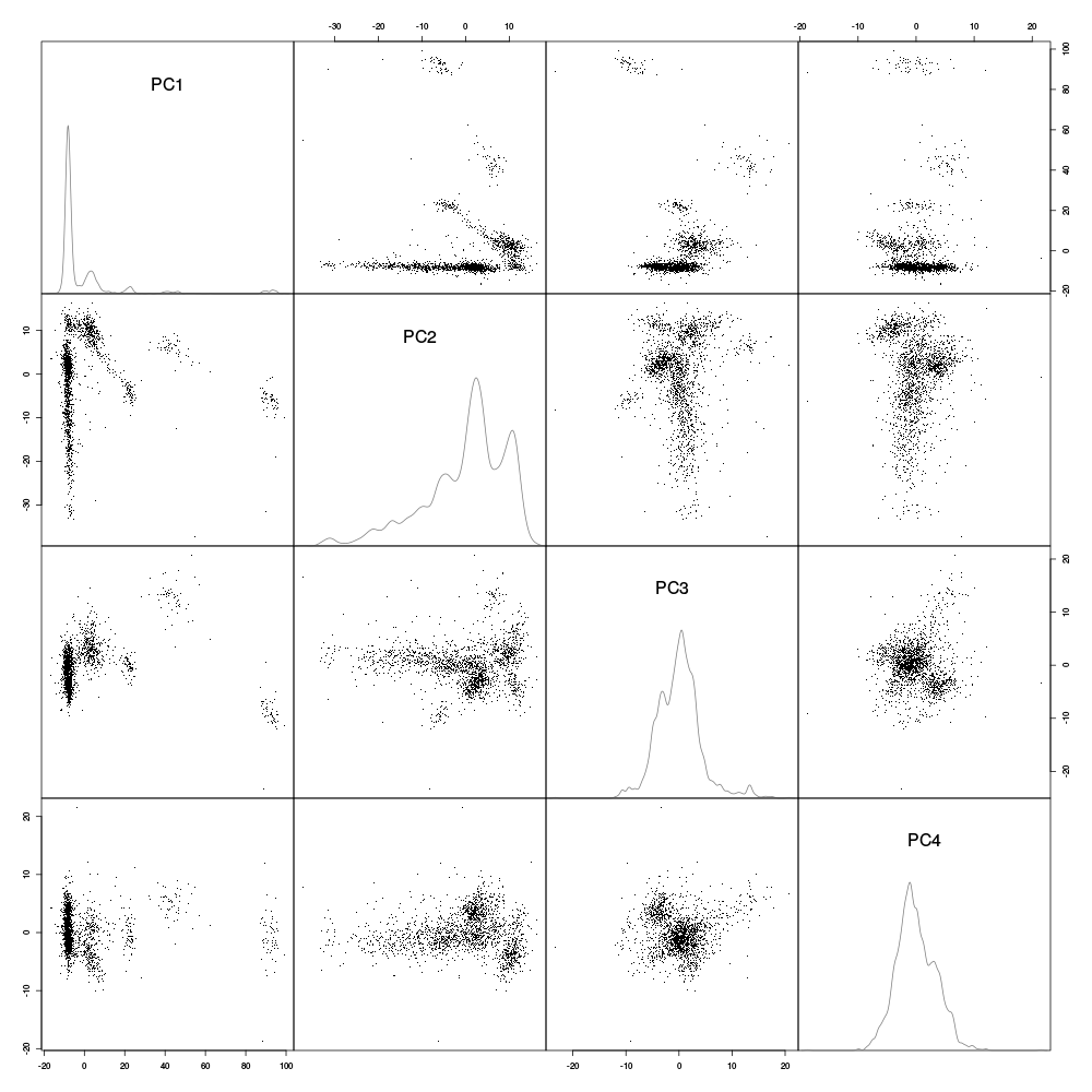
Figure 14: Scatter plot matrix with evts1Eo2 sample (clean events) projections onto planes defined by pairs of the first 4 principal components. Density estimates of the projections on single components are shown on the diagonal. These estimates were obtained with a Gaussian kernel.
The "large" doublet / triplet firing neuron shows up as two small very well separated clouds which can be localized by drawing (in your mind) an axis between the centers of the two clouds which would then form an angle of approximately 120 degrees with the horizontal (using the trigonometric convention – counter-clockwise – for positive angles) on the scatter plot on the first row, second column. A very elongated nearly continuous cluster is prominent on the same scatter plot showing up as an horizontal band at -20 on the first PC. Although both projections on the third and fourth PCs look nearly feature less (diagonal density plots) the projection on the plane defined by PC 4 and PC 3 (row 3 column 4) exhibits two well separated clusters.
We can look at the scatter plot matrices obtained with the next group of four PCs:
pairs(evts1E.pc$x[,5:8],pch=".",gap=0,diag.panel=panel.dens)
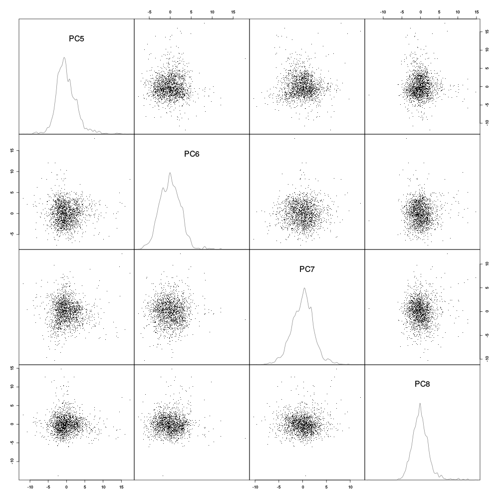
Figure 15: Scatter plot matrix with evts1Eo2 sample (clean events) projections onto planes defined by pairs of principal components 5 to 8. Density estimates of the projections on single components are shown on the diagonal. These estimates were obtained with a Gaussian kernel.
We see that unless we assume that we have a strong over plotting problem (which is easily ruled out by regenerating the plot using only 500 data points, not shown), principal components 5 to 8 do not give "informative" projections (in the sense of giving rise to clearly separated clusters). This analysis suggests that working with the first four principal components should lead to a nearly optimal clustering.
At that stage we go through the dynamic visualization with GGobi. Although this can be done by calling GGobi directly from R (if you have the rggobi package), I usually prefer doing it by writing the data to disk in csv format and starting GGobi separately:
write.csv(evts1E.pc$x[,1:4],file="evts1E.csv")
What comes next is not part of this document but here is a brief description of how to get it:
- Launch
GGobi. - In menu: File -> Open, select evts1E.csv.
- Since the glyphs are rather large, start by changing them for smaller ones:
- Go to menu: Interaction -> Brush.
- On the Brush panel which appeared check the Persistent box.
- Click on Choose color & glyph….
- On the chooser which pops out, click on the small dot on the upper left of the left panel.
- Go back to the window with the data points.
- Right click on the lower right corner of the rectangle which appeared on the figure after you selected Brush.
- Drag the rectangle corner in order to cover the whole set of points.
- Go back to the Interaction menu and select the first row to go back where you were at the start.
- Select menu: View ->
Rotation. - Adjust the speed of the rotation in order to see things properly.
- After a while select menu: View ->
2D Tour. You are going to visualize the 4 dimensions simultaneously. - Adjust the speed again.
Watching at the clouds spinning I see 8 clusters, 7 of which can already be distinguished on the projection onto the plane defined by principal components 1 and 2 above (all these clusters are not well separated on this projection but can be clearly distinguished with the dynamical display of GGobi's 2D Tour). The very elongated cluster seen on the same projection remains a very elongated cluster on 2D Tour displays.
7.1.9 Clustering
Since we have clusters of different shapes and a very elongated one, trying clustering with a Gaussian mixtures model allowing for cluster specific covariance matrices seems reasonable. We are going to do that with function Mclust of package mclust. If you haven't installed this user contributed package yet it is time to do it with:
install.packages("mclust")
The documentation of the package is clearly written and abundant. You should take a good look at it to become an informed and independent mclust user. We are going to use a rather simple approach where we do not the software "decide" on the "right" number of clusters. Usually if we do that using a BIC criterion the software does a pretty good job but it overestimates the cluster number systematically. With experience it seems that an approach where a first guess based on visualization with GGobi, followed if necessary by re-clustering some compounded clusters (if there are any at the end of the first run), works fast and well.
So we are going to cluster with 8 Gaussians allowing for a cluster specific covariance matrix and leaving room for a "noise" cluster (a non-Gaussian but uniform cluster):
library(mclust)
set.seed(20110928,"Mersenne-Twister")
init.noise <- sample(c(TRUE,FALSE),
                     size=dim(evts1E.pc$x)[1],
                     replace=TRUE,
                     prob=c(0.05,0.95)
                     )
evts1E.mc8 <- Mclust(evts1E.pc$x[,1:4],G=8,
                     modelNames="VVV",
                     initialization=list(noise=init.noise)
                     )
The classification produced by Mclust is contained in elements classification of the returned list. We can simply get the number of events per cluster with:
table(evts1E.mc8$classification)
 0   1   2   3   4   5   6   7   8
60 396 723 106 186  11  85 174  66
Here cluster 0 is the noise cluster. In order to facilitate comparison with clustering performed with other methods, or a different number of clusters, or different initial guesses, we order the cluster according to their "size" (the sum of the absolute value of their central event):
c8 <- evts1E.mc8$classification
cluster.med <- sapply(1:8,
                      function(cIdx) median(evts1Eo2[,goodEvts][,c8==cIdx])
                      )
sizeC <- sapply(1:8,function(cIdx) sum(abs(cluster.med[,cIdx])))
newOrder <- sort.int(sizeC,decreasing=TRUE,index.return=TRUE)$ix
cluster.mad <- sapply(1:8,
                      function(cIdx) {
                        ce <- t(evts1Eo2)[goodEvts,]
                        ce <- ce[c8==cIdx,]
                        apply(ce,2,mad)
                      }
                      )
cluster.med <- cluster.med[,newOrder]
cluster.mad <- cluster.mad[,newOrder]
newOrder <- c(1,newOrder+1)
c8b <- sapply(1:9, function(idx) (0:8)[newOrder==idx])[c8+1]
7.1.10 Checking clustering results
The best way to check the results is to look side by side at dynamical GGobi displays and static plots of events belonging to a single cluster. To inspect the results with GGobi we write to disk the data as before but we add to them a new column or variable containing the clustering result:
write.csv(cbind(evts1E.pc$x[,1:4],cluster=c8b),file="evts1EsortedMC8.csv")
Again the dynamic visualization is not part of this document, but here is how to get it:
- Load the new data into
GGobilike before. - In menu:
Display->New Scatterplot Display, selectevts1EsortedMC8.csv. - Change the glyphs like before.
- In menu:
Tools->Automatic Brushing, selectevts1EsortedMC8.csvtab and, within this tab, select variablecluster. Then click onApply. - Select
View->2D Tourlike before and see your result. Do not forget to deselect theclustervariable on this display you will be otherwise misled into thinking that one dimension gives you perfect separation of your clusters.
Cluster 0, the "noise" cluster, looks essentially correct corresponding to rather isolated points on GGobi display. The static plot is obtained with:
plot(evts1Eo2[,goodEvts][,c8b == 0],y.bar=10)
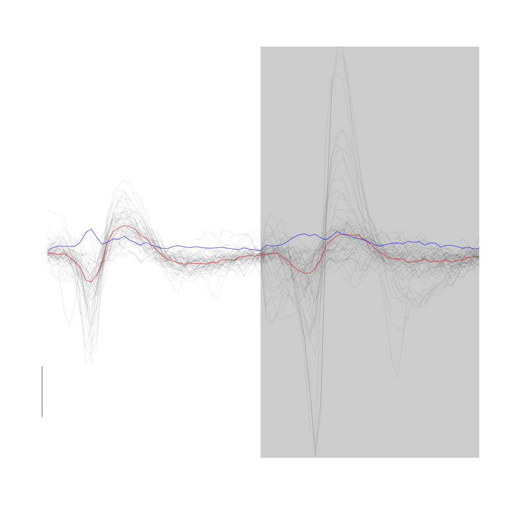
Figure 16: Noise cluster from the "clean" sub-sample of evts1Eo2. This cluster was obtained with a Gaussian Mixture plus Noise clustering performed with function Mclust of package mclust. 8 genuine Gaussian were included in the model and the first four principal components were used. Scale bar: 10 MAD.
Cluster 2 of the model lumps together two actual clusters likely to correpond to the doublet firing neuron of site 2.
plot(evts1Eo2[,goodEvts][,c8b == 2],y.bar=10)
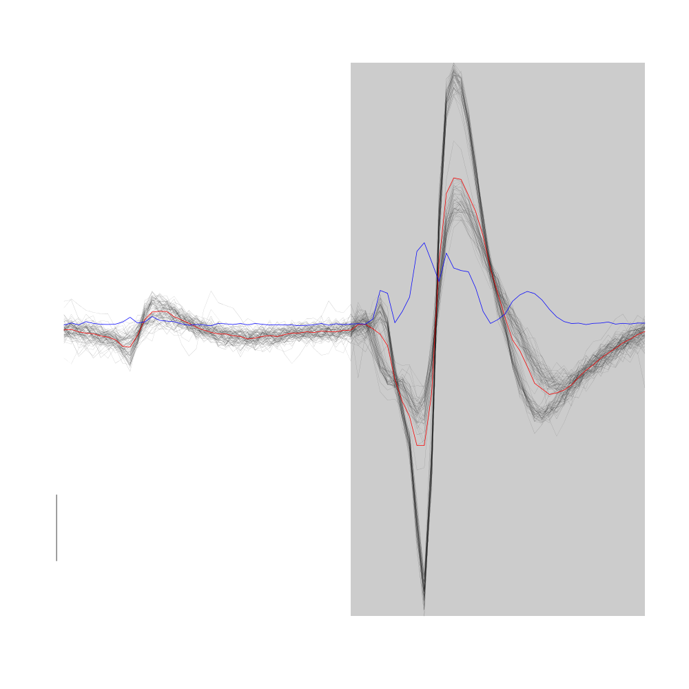
Figure 17: Cluster 2 from the "clean" sub-sample of evts1Eo2. This cluster was obtained with a Gaussian Mixture plus Noise clustering performed with function Mclust of package mclust. 8 genuine Gaussian were included in the model and the first four principal components were used. Scale bar: 10 MAD.
Cluster 1 is the tiniest cluster corresponding to "perturbations" of events likely originating from cluster 2.
plot(evts1Eo2[,goodEvts][,c8b == 2],y.bar=10,medAndMad=FALSE)
lines(evts1Eo2[,goodEvts][,c8b == 1],evts.col=2,evts.lwd=1)
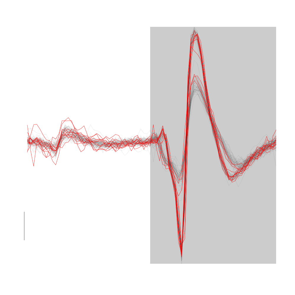
Figure 18: Cluster 1 (in red) from the "clean" sub-sample of evts1Eo2. Events from cluster 2 appear in black. This cluster was obtained with a Gaussian Mixture plus Noise clustering performed with function Mclust of package mclust. 8 genuine Gaussian were included in the model and the first four principal components were used. Scale bar: 10 MAD.
Cluster 3 (green points with default settings on GGobi) is made of essentially non-variable events which are "large" on both sites:
plot(evts1Eo2[,goodEvts][,c8b == 3],y.bar=10)
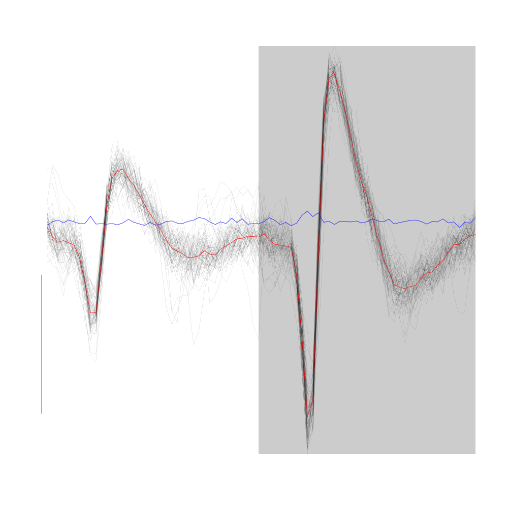
Figure 19: Cluster 3 from the "clean" sub-sample of evts1Eo2. This cluster was obtained with a Gaussian Mixture plus Noise clustering performed with function Mclust of package mclust. 8 genuine Gaussian were included in the model and the first four principal components were used. Scale bar: 10 MAD. The central event and the MAD time course are not shown as done on the previous plots. Orange curves correspond to the pointwise first quartile (lower) and pointwise third quartile (upper) of cluster 5.
Cluster 4 is a cluster with "small" events:
plot(evts1Eo2[,goodEvts][,c8b == 4],y.bar=10)
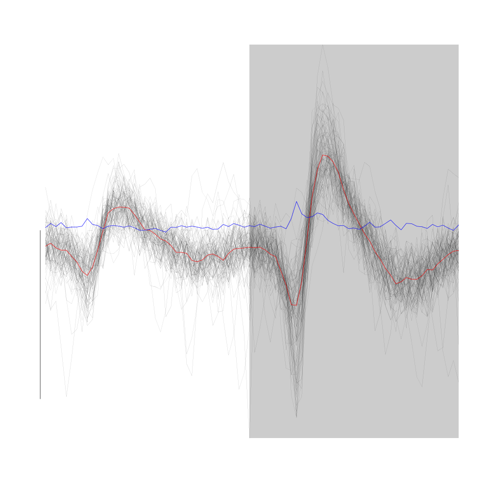
Figure 20: Random samples of size 100 from cluster 4 (black) and 6 (red) from the "clean" sub-sample of evts1Eo2. These clusters were obtained with a Gaussian Mixture plus Noise clustering performed with function Mclust of package mclust. 8 genuine Gaussian were included in the model and the first four principal components were used. Scale bar: 10 MAD. The central event and the MAD time course are not shown. #+label: fig:cluster-4-and-6-from-evts1E
Cluster 5 is the very elongated cluster we already identified.
plot(evts1Eo2[,goodEvts][,c8b == 5],y.bar=10)
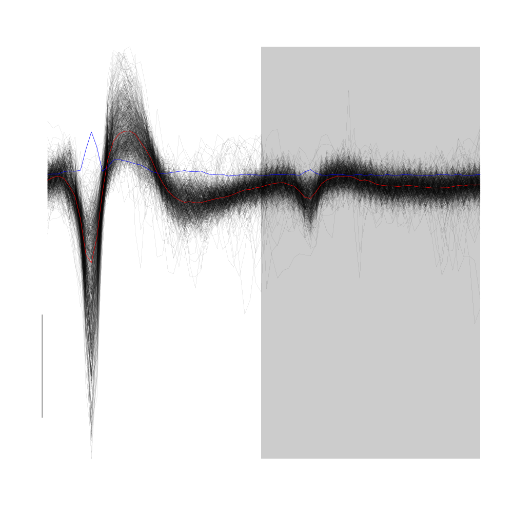
Figure 21: Cluster 5 of the "clean" sub-sample of evts1Eo2. This cluster was obtained with a Gaussian Mixture plus Noise clustering performed with function Mclust of package mclust. 8 genuine Gaussian were included in the model and the first four principal components were used. Scale bar: 10 MAD. The central event and the MAD time course are shown in red and blue respectively.
Cluster 6 is made of relatively small spikes mainly visible on site 2.
plot(evts1Eo2[,goodEvts][,c8b == 6],y.bar=10)
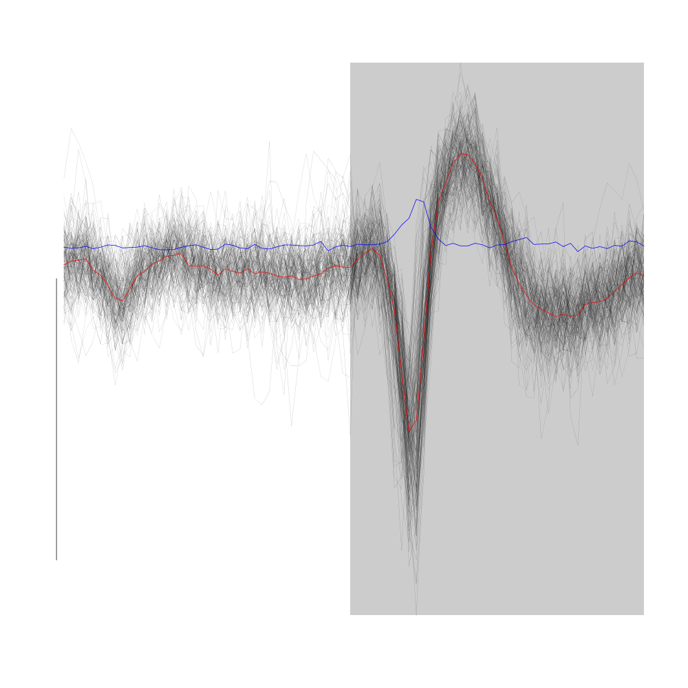
Figure 22: Cluster 6 of the "clean" sub-sample of evts1Eo2. This cluster was obtained with a Gaussian Mixture plus Noise clustering performed with function Mclust of package mclust. 8 genuine Gaussian were included in the model and the first four principal components were used. Scale bar: 10 MAD. The central event and the MAD time course are shown in red and blue respectively.
Cluster 7 is a compact cluster located "close to the base" of cluster 5. It is best seen on the projection onto the plane defined by principal component 2 and principal component 4. On the dynamic display provided by GGobi it clearly stands out.
plot(evts1Eo2[,goodEvts][,c8b == 7],y.bar=10)
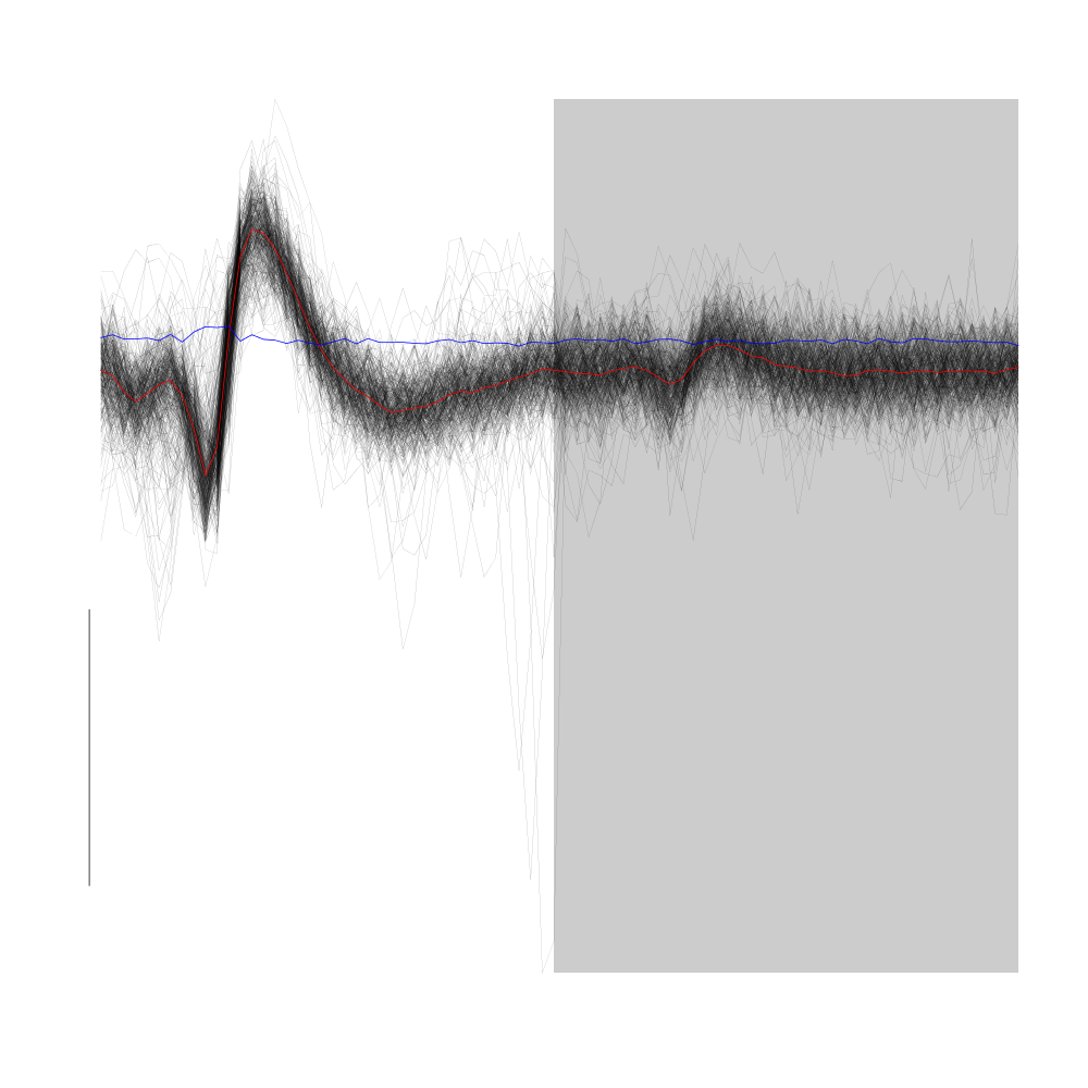
Figure 23: Cluster 7 of the "clean" sub-sample of evts1Eo2. This cluster was obtained with a Gaussian Mixture plus Noise clustering performed with function Mclust of package mclust. 8 genuine Gaussian were included in the model and the first four principal components were used. Scale bar: 10 MAD. The central event and the MAD time course are shown in red and blue respectively.
The compactness of this clusters clearly originates in the absence of variability of its events.
Cluster 8, the "tiniest" one, is very likely to be due to some electrical noise. An example of it can be found on the figure were the comparison between the raw data and their derivatives was done. Look at the very fast voltage deviation before the very large spike on site 2. Another clue of its artefactual origin is that it appears on the four recording sites with essentially the same amplitude.
plot(evts1Eo2[,goodEvts][,c8b == 8],y.bar=10)
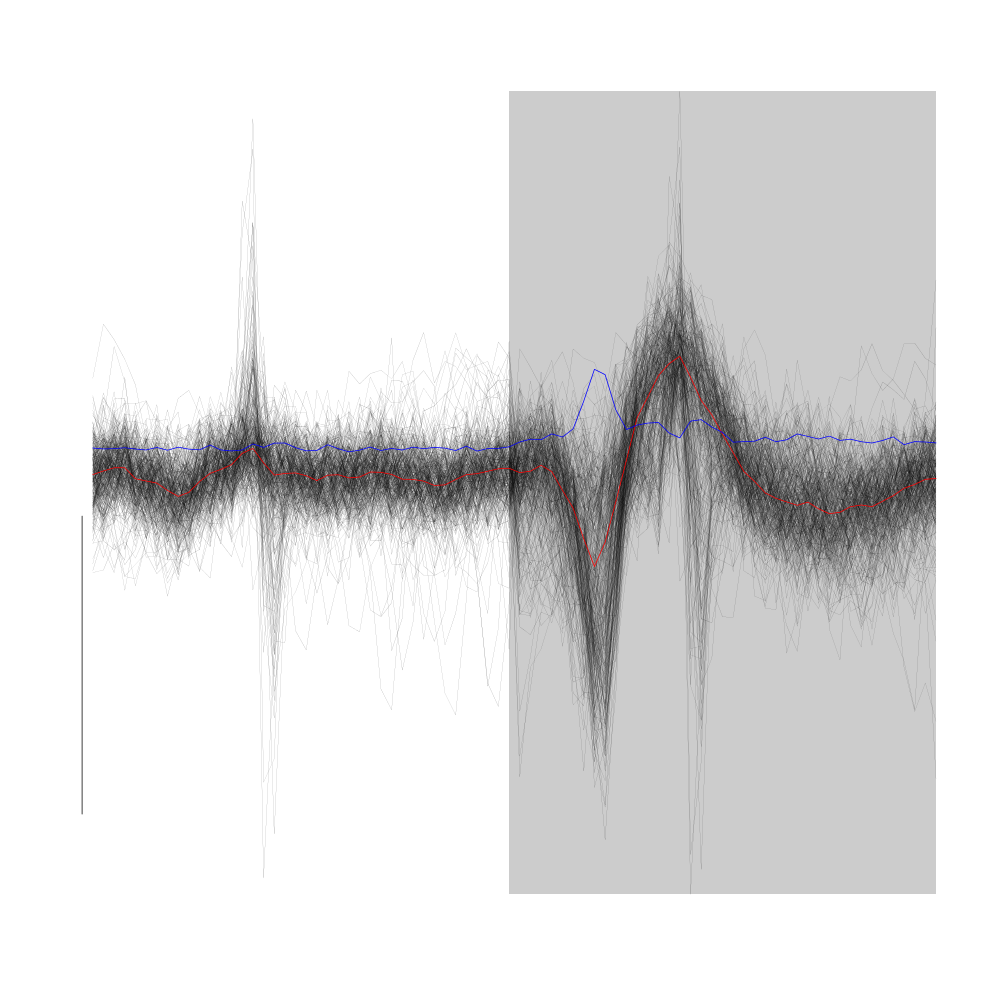
Figure 24: All the events from cluster 8 of the "clean" sub-sample of evts1Eo2. This cluster was obtained with a Gaussian Mixture plus Noise clustering performed with function Mclust of package mclust. 8 genuine Gaussian were included in the model and the first four principal components were used. Scale bar: 10 MAD. The central event and the MAD time course are shown in red and blue respectively.
7.1.11 Conclusion on this first clustering phase
We can conclude that events attributed to clusters 0, 1 and 8 are in fact superposed (for 0 and 1) or artefactual events. We will therefore keep going with a model containing 6 units (but 7 clusters since unit 1 is made of 2 clusters) and we reorganize our goodEvts and c8b variables as follows:
goodEvtsB <- goodEvts
goodEvtsB[goodEvtsB][c8b %in% c(0,1,8)] <- FALSE
c6b <- c8b[!(c8b %in% c(0,1,8))]
for (i in 2:7) c6b[c6b==i] <- i-1
7.1.12 Cluster specific events realignment
Now that we have clusters looking essentially reasonable, we can proceed with a cluster specific events realignment. We are going to do that iteratively alternating between:
- Estimation of the central cluster event
- Alignment of individual events on the central event
We stop when two successive central event estimations are close enough to each other. Here the distance between to estimations is defined as the maximum of the absolute value of their pointwise difference. The yardstick used to decide if the distance is small enough is an estimation of the pointwise standard error defined as the MAD divided by the square root of the number of events in the cluster. The routine we use next alignWithProcrustes generates automatically plots (per default) showing the progress of the iterative procedure. These plots do not appear in the present document. The numerical summary appearing while the procedure runs appears bellow. After each iteration the maximum of the absolute of the median difference (multiplied by the square root of the number of events and divided by the MAD) is written together with the maximum allowed value. While the scaled difference is larger than the maximum allowed value the iterative procedure proceeds.
ujL <- lapply(1:length(unique(c6b)),
              function(cIdx)
              alignWithProcrustes(sp1E[goodEvtsB][c6b==cIdx],stereo1E,14,25)
              )
 Template difference: 1.285, tolerance: 1
_______________________
Template difference: 0.881, tolerance: 1
_______________________
Template difference: 2.545, tolerance: 1
_______________________
Template difference: 1.011, tolerance: 1
_______________________
Template difference: 0.153, tolerance: 1
_______________________
Template difference: 1.559, tolerance: 1
_______________________
Template difference: 0.806, tolerance: 1
_______________________
Template difference: 3.192, tolerance: 1
_______________________
Template difference: 0.943, tolerance: 1
_______________________
Template difference: 1.845, tolerance: 1
_______________________
Template difference: 0.917, tolerance: 1
_______________________
Template difference: 3.669, tolerance: 1
_______________________
Template difference: 1.816, tolerance: 1
_______________________
Template difference: 1.374, tolerance: 1
_______________________
Template difference: 0.808, tolerance: 1
_______________________
We can now get a summary plot of this clustering phase using the powerful user contributed package ggplot2 (that you will have to install if it's not already done):
library(ggplot2)
template1E.med <- sapply(1:6,function(i) median(ujL[[i]]))
template1E.mad <- sapply(1:6, function(i) apply(ujL[[i]],1,mad))
template1EDF <- data.frame(x=rep(rep(rep((1:40)/15,2),6),2),
                         y=c(as.vector(template1E.med),as.vector(template1E.mad)),
                         channel=as.factor(rep(rep(rep(1:2,each=40),6),2)),
                         template1E=as.factor(rep(rep(1:6,each=80),2)),
                         what=c(rep("mean",80*6),rep("SD",80*6))
                         )
print(qplot(x,y,data=template1EDF,
            facets=channel ~ template1E,
            geom="line",colour=what,
            xlab="Time (ms)",
            ylab="Amplitude",
            size=I(0.5)) +
      scale_x_continuous(breaks=0:3)
      )
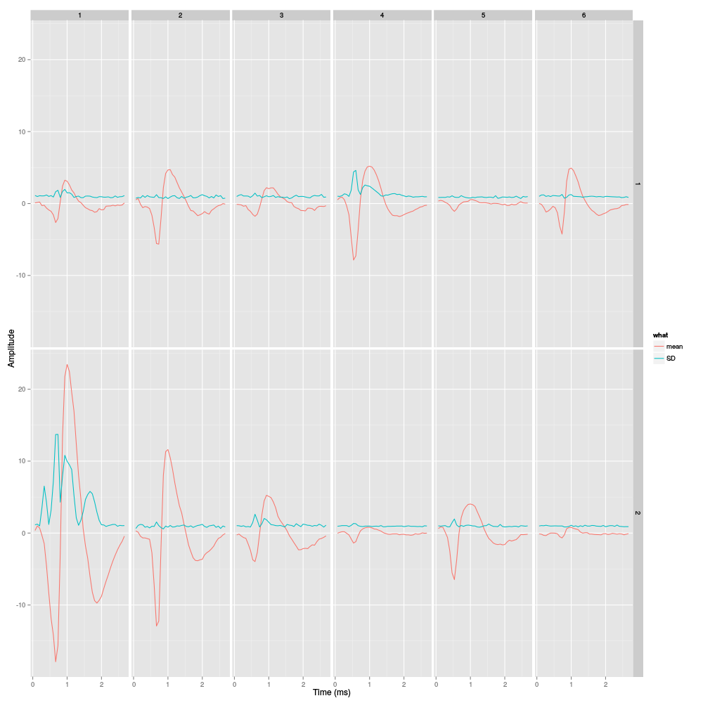
Figure 25: Summary plot with the 6 templates of stereode 1 corresponding to the robust estimate of the mean of each cluster. A robust estimate of the clusters' SD is also shown. All graphs are on the same scale to facilitate comparison. Columns correspond to clusters and rows to recording sites.